Sometimes, when I make a card that I don’t like – I have a miniature panic attack..it’s pretty unreasonable really, but it happens nonetheless. I think to myself…”Welp, that’s it – I’m out of ideas. I’m closing up shop. I’ve lost any talent I ever had for cardmaking.”
This is exactly what happened this weekend when I sat down to play with my stamps.
I reached for Papertrey Ink’s Delightful Doilies set and the coordinating dies, both of which I haven’t used in months. Then, things started to get a little iffy.
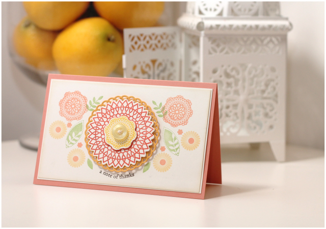
I was bound and determined to use those doilies to create a folk-artsy card. My first attempt was …well…uh…not so cute. Funny thing is – I thought it was down right fabulous until I photographed it, walked away, then came back to edit the pictures. Then I saw it for what it really was – a hot mess that was unappealing to me and NOT what I wanted.
Against all better judgement, I’m gonna show you version one of my Delightful Doilies card, because I’ve gotta be an honest blogger and ugly cards are just part of the territory when you a crafty person.
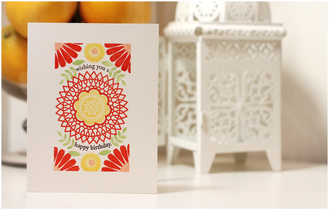
Here’s the second version:

Amber, there is way more right with your first card than there is wrong with it! Your color palette is delightful and there is actually a lovely symmetry to it…. You are being too hard on yourself!
I do agree that your second card is a knock-out, though! The colors have a fabulous punch to them and your design is stunning. Love that you masked a border… I’m not usually a fan of one-layer cards, but yours could make me change my mind! 🙂
I know we have a tendency to be self critical and we do it with a vengeance. I like your second card better than the first, too. But. But. But. You are an extremely talented stamper/cardmaker. To someone less gifted perhaps his/her best effort would not even be even close to your first card.
I don’t consider myself as talented as you or any of the bloggers I follow. Yet I have been told my denigration of my work has made others feel they might as well give up because they could never do something as good as what I was knocking. Just a little bit of perspective. Your blog is one of my very favorites.
You’re nuts. I LOVE the first one – it’s different from your usual style, what with the layers and such – but it’s PERFECT! You’re too critical of yourself, my friend!
I doubt every minute! Thanks for showing us both versions. Very interessant! You are so talented!
OMG if that was my failed attempt I’d be so happy! I know how you feel though, it’s just not how you pictured it to be. I actually blogged a horrendous attempt at a card on sunday, I didn’t do a re-make though, I just wanted to forget the whole sorry thing! 😉
Beth xx
Amber, thanks for sharing your “ugly card”. It’s nice to know that even though you are so talented, you sometimes make cards that you think are ugly. It’s quite pretty, but I think that second card is PERFECT! Gorgeous work!
I regularly feel like I’ve lost my talent, LOL! I just keep stamping, and eventually something I like comes out of all the work. 🙂
Ohh Amber!! I am glad I am not the only one to whom this happens 😉 I like both cards but there is no doubt the second one is just stunning. Ypur blog is always such a great place to come for inspiration 😉
You are right, the second card IS better, but the first one is just not quite your style – a little too bland. Sometimes we accidentally wander a little in other peoples style and feel strange. How nice of you to let us take part in your wanderings – and how you found back to your personal style.
Greetings, Christine
oh my goodness I love your first card! hehehehe! But that second one is beautiful too! We are all too often our worst critics!
Really? I love the first card. The design is “free-flowing” and less confined and the layered look works. However, your second card is a show stopper. It has clean lines and elegance. I can relate to your dilemma though. Sometimes I post a card on my blog immediately after finishing it and when I look at it a day later, I am appalled that I actually posted it!
Amber that is something we all feel from time to time. Both of your cards are without question gorgeous! I get it, if it doesn’t feel right then do a redo. Your redo is stunning with the red flowers on your border–excellent masking.
Ha! You’re making me giggle, girlie! If my ‘ugly’ was anything close to your beautiful version of ‘ugly’ then I’d be a happy stamper!
I do adore your simple, second version though – you got the folk art down to a ‘T’!
Hugs!
x
so pretty.. I really like the bright bold colors 🙂 hugs
I don’t get it! They are both so awesome! Ok, I get it a little, only because your second one is INDEED very folk artsy but I don’t agree that the first one is an epic fail! I should have such bad luck on my first try!
LOL, how funny you are Amber and I really appreciate your honesty – The first card is very pretty but the second card is phenomenal. I would never put ugly and your first card in the same sentence though – 🙂
AMBER! I do not know what you’re talking about! Your first card is so lovely. I love the colors and the layering. I’d love to receive that card in the mail. Do be so hard on yourself. The first one looks soft while the second one is bold. I love them both.
I meant to say, do not be so hard on yourself.
craftea
I enjoyed this post!
I love your honesty and have to give you bonus points for sharing it!! I can totally relate and while I think card number one is great, I adore card number two!
I don’t always leave you comments but I love love love your work!!
Thanks soo much for sharing your first try! I am happy to know amazing card makers like you struggle and have not so great cards now and again! You turned it around brilliantly though and I love the second attempt! Lovely!
I think they both look great. I do love those colors together. You did a great job making it look folk artsy.
I know very well the panic feeling that you describe. I must say, however, that I really like your first and second cards. We are always our own harshest critics.
Sometimes I find it easier just to walk away, and then come back when I’m ready, usually alot less frustrated and with a fresh mindset! Your cards are always amazing (even the first card) but the second version is…. perfect!
Thanks for sharing the card you didn’t like. I love the stronger colors and design of your remake.
Yes, Amber! I feel like this all too much! I often wonder what am I even doing spending all of my money on all these supplies when I don’t seem to be getting any ‘better’ at making cards. I always thought the more I did it, the better I would get. I thought I would turn into a Nichole Heady or a Dawn McVey or a Dr. Amber. But I don’t. It still takes me just as long to make a card that I post and don’t get a lot of “Ohhhh’s and Ahhhh’s” for. My work is mediocre, at best. So, I don’t update my blog as much. But, I still love it…the whole card making thing. Even if I don’t become a ‘celebrity’, I do still enjoy the process. Thank you for always being so honest. It is good to hear that from you, and I think both cards are beautiful, but your second is definitely a “WOW!”.
I actually like the first card better; I like the symmetry and the diecut layers. Although maybe the button is a bit much.
I have only had a couple of cards turn out bad enough that I had to disassemble them and start over. One I was able to salvage, one I had to toss. But there are many cards that, although not fatally flawed, are not what I envisioned, and of which I am not proud. I call these “cards for people I hate.”
But sometimes, I put them away for a while, and when I come across them again, think, eh, it’s not so bad.