True story: when I was a kid I used so say that I wanted to be a food photography stylist. I’ve always been fascinated by the lengths stylists will go to create “the shot.” I think natural selection had something to do with the fact that I never made it as a food stylist…because let’s be honest…if there is food around me, it’s getting eaten…not photographed.
Styling photos for Damask Love is definitely my favorite part of the job. I love coming up with creative props that can make a photo more interesting. If you’ve read Damask Love for a while, you know that my photos are very “proppy.” I use a lot of “stuff” in my photos – that’s just my preference. There are plenty of other blogs that take the “prop-less” route and the outcomes are beautiful. For today’s installment of “The Non-Photog’s Guide” I’m sharing my approach to props and photo styling. None of what I say here is a hard and fast rule, rather my personal approach. To develop this post, I literally just sat down and looked through two years of Damask Love photos and “studied” my own styling and prop habits. I categorized them and I’m here to give you a few of my own ideas on the topic. I hope you find this information, helpful!
 If we’re being honest, I am obsessed with props. If I had my druthers, I would sell all my worldly possessions, buy a cot and move into the prop room at Martha Stewart Headquarters in NYC. They can just stick me between the cakestands and the candlesticks. I promise, I’ll be quiet and I won’t bother anyone!
Given my penchant for props, I am constantly adding them to my collection. Now, I certainly don’t have a Martha-style stockpile, but I have a few pieces that serve me well in my blog photography:
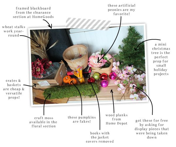 These are some of my most used props for blog photos. You probably recognize a few of them from photos on Damask Love. Generally, I take a four seasons approach to props. I like to have a few pieces that fit in each season of the year. My roll of craft moss and artificial peonies are perfect for spring. My pumpkins and artificial autumn leaves (not pictured) are two of my favorite fall themed props. Of course, there are also plenty of year-round props, like crates, buckets and my trusty chalkboard that comes in handy all of the time!
Click through to see the rest of the post and all the photos hat I have for you!
There’s a lot that goes on behind-the scenes of a blog photo. Personally, my photo shoots are a big mess…
There is a method to the madness though…I promise! Here are a few of the things I consider when photographing for Damask Love:
 I am always fighting the urge to throw my favorite props into every photo. I have to remind myself that sometimes my favorite props don’t make sense in the photo. I try to think of the theme or spirit of my focal item and create a photo that jives with that theme. Here’s an example:
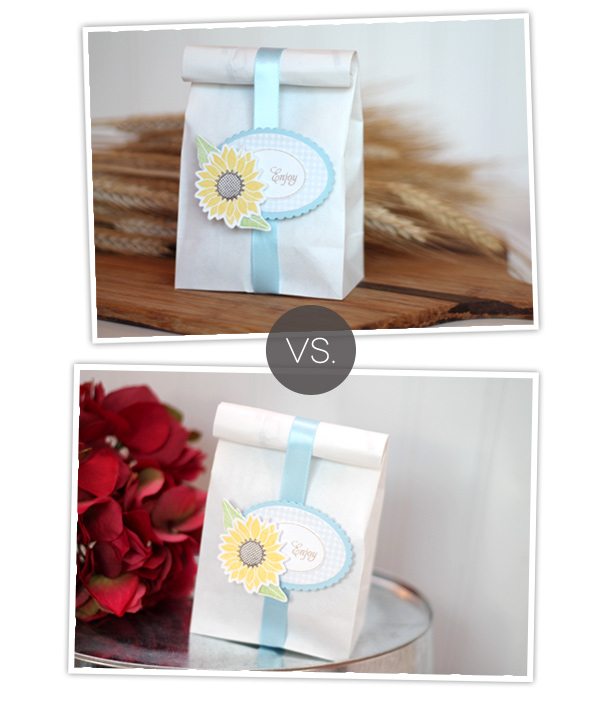 While I do love both of these photos, the springtime, country feel of the focal item makes more sense in the bottom photo. The wheat stalks in the first photo remind me more of a fall, rustic scene – so as much as I love them, I just have to save them for another photo.
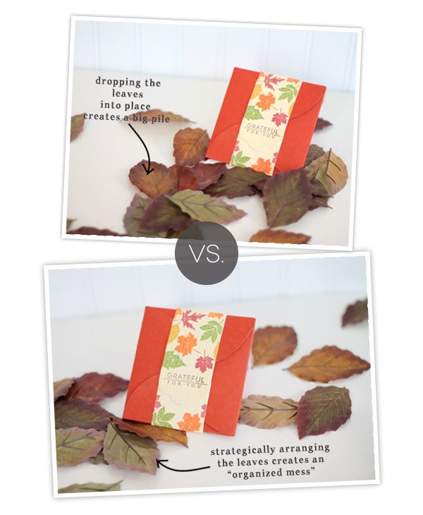
 I love the look of a little chaos in my photos. Makes them look a bit more organic. Confetti, for example, can look great scattered throughout your photo, but if you just plop it into the photo, chances are it will just look messy. This is your chance to “make” your own mess…
 You’ve probably heard the suggestion that you should include a bit of “nature” in photos. I love to do this with flowers or fruit. Even if they are artificial, they still give the look of something natural…something that “breaths.” You can take this to the extreme and include something that breaths…literally…yourself! Photos that include hands is a big trend in product photography, so I’ve just recently begun to consider it to be a useful approach for photos on Damask Love. Here’s a comparison….
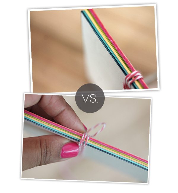 Both photos show the exact same product, but by including my hand in the photo, I can include a bit of “human-ness” to the blog and show that I’m involved in each part of the process.
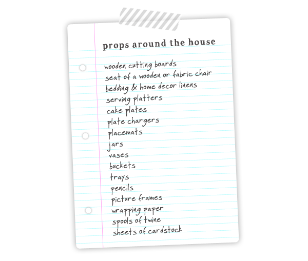
 Adding a bunch of props to your already filled home may not be on the top of your to-do-list. I get it. A few weeks ago, I purchased some huge birch branches to use as props…and now we have a ginormous “tree” in the corner of the craftroom. There are plenty of options for props that you probably already own. Take a look around and see what you’ve got…use it…play with it and see how you like the result.
 There are tons of prop-tions (get it? Prop Options?!) – and once you’ve settled on the props for your photo, there are some things you can consider when it comes to styling.
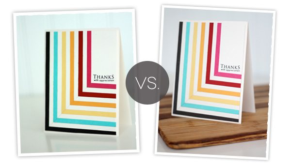
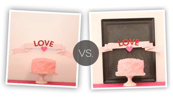 Anchoring the focal item can provide structure and contrast to the photo. I try to do this as much as possible. Even something as simple as a piece of cardstock can anchor your focal item.
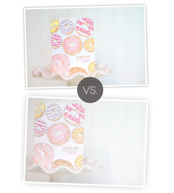
 This is one of my very favorite techniques for styling, and I didn’t even realize it until I studied some of my old photos. Chomping a bit of the photo can make things more interesting. To me, it creates an extension of the photo beyond what the eye can see. There is something “more” happening in the photo when it’s slightly cut off.
Cropping out part of the photo can also give the eye some direction about what to look at. In this photo of the books and bookmark, the first photo includes full shots of the books – and consequently the eye focuses on the books rather than the bookmark. By cropping out the books some, they are still recognizable, but the eye focuses on the bookmark first – which is the focal item of the photo.
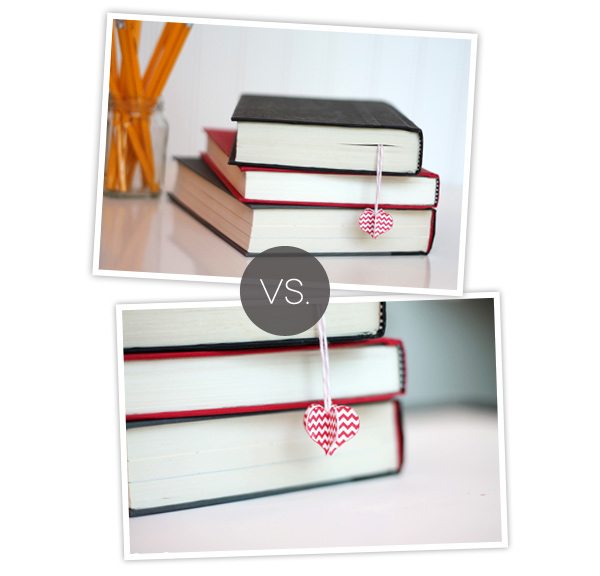
 So – after sifting through two years of photos, I now realize that I do this all the time! If you take a browse through some Damask Love posts, you’ll notice this technique throughout.
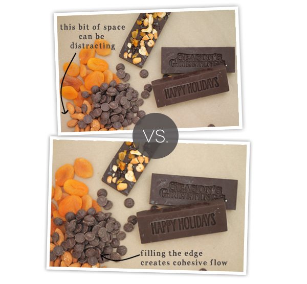
Filling the edge of the photo creates flow and continuity. There is a cohesive scene rather than a focal item that sort of floats in the middle of the photo. Of course, this is a matter of preference, but I really love the look of props that peek in from the edge of a photo.
 Creating the “lived-in” look with product photos is the same idea that realtors use when staging a home. Creating a “lived-in” look gives readers a complete “idea” for the item in the photo. They can see what it’s for, they can begin to picture it in their own homes. The “lived-in” look gives purpose to the item in the photo.
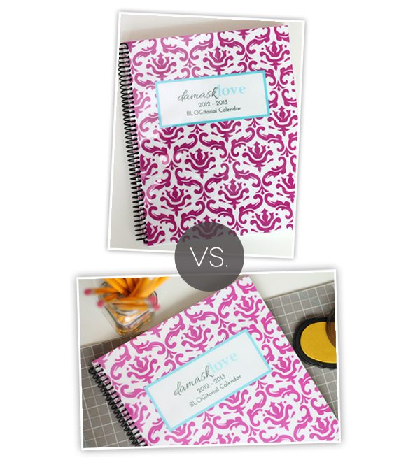
For this DIY editorial calendar project, the first photo does a great job of showing you the project, but there is something missing. By adding a few of my craftroom elements, the editorial calendar now has a “purpose.” You can see how I use it and begin to think of how you might use it, too!
The same idea works for this wreath calendar. Alone, the photo allows you to focus on the details of the calendar – and of course this type of photo has it’s own important purpose…maybe for the tutorial portion of a post. The lower photo shows the wreath “in action” and allows readers to envision this project in their own space. There are all sorts of random tools you can use to give lift to your projects. I do this all the time. In the final photo, you don’t see all the elements, but they are very integral to the shot.
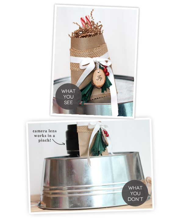
With this rustic holiday gift bag, I used a camera lens to prop it up. The final photo is much more interesting than if I simple photographed the bag laying down.
When shooting these tags, I used an acrylic block to prop up the middle tag. This adds depth to the photo and also tells the eye which of the tags to look at. If I had photographed this tag flat along with the other, the eye would focus on each of the elements equally. By propping up the yellow tag, it gets to be the star of the show.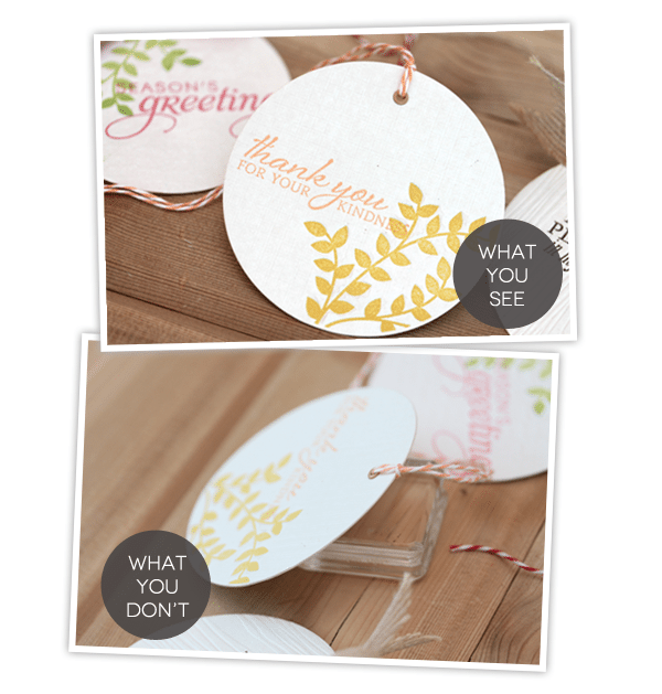
 {ASK!} Many of my props are items that I’ve gotten for free by simply asking! When I go to Pottery Barn or West Elm, I ask about the props that are being used in displays. Sometimes, the employee or manager will tell me that the display is being dismantled and I can come by to pick up some of the elements in the display! SCORE! Give it a try – of course you may get some crazy looks, but it has worked for me and it can definitely work for you!
{OVERHEAD SHOTS} Straight on shots from over top the focal image are popular in blog photography. I use them a lot for my cards as well as photographing the supplies in a tutorial or the elements of a card kit. One thing to remember when doing this: make sure all the items are lined up neatly! One slight tilt or item out of alignment in a row will jump out in an overhead photo.
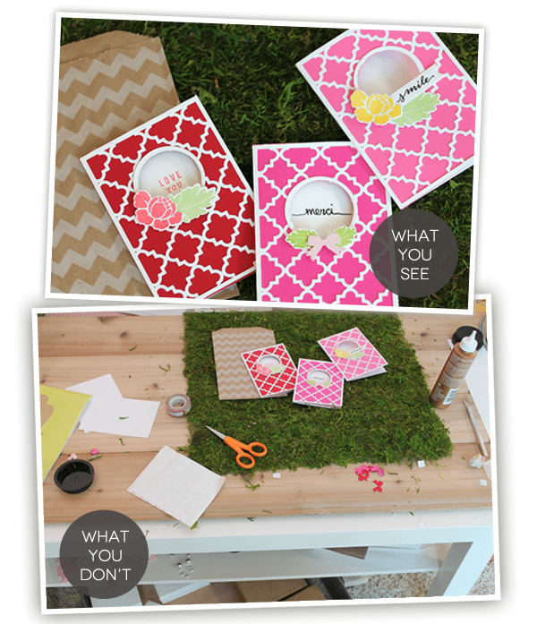
{THE LIVED-IN LOOK FOR STATIONERY} When photographing cards, you can create a “lived-in” look by simply adding an envelope to the photograph. I do this in many of my photos and I think it creates a complete package and show exactly how the card can be packaged up and given away to a friend!
Thanks for making it through today’s post! I hope it’s been helpful and that you’ve picked up a tip or two that you can put to use in your own blog photos!
ETA: 6/19/2013
{HOW TO USE THESE TIPS}: The content of this post is intended to serve as instruction and inspiration for your own blog photos. It is not permission to duplicate the photo styling that you see here on Damask Love. I work hard to produce photos that are identifiable and represent this blog. Thanks!
- Love the comments on “cropping clearly” in this post on DesignSponge
- Take some time to visit the great links in this post from Decor8
- Centsational Girl offers many of the same tips that I mention here, along with some additional ones that you’ll appreciate.
- $15 will buy you an hour with super-duper photographer Justin Hackworth who is partnering with Alt Summit to offer a class on how to take photos for your blog. The class offers plenty of time for asking questions, which I love.
- Pencil Shavings is a great blog…only made greater by this post all about styling products for photography.






internal traffic
DoFollow backlinks.
A DoFollow link passes link juice to your target site, while each link is checked thoroughly to ensure there are no NoFollow attributes.
We provide a full performance report as a .txt document with the URLs of websites where your link was placed.
It is recommended to embed links naturally using keyword-rich anchors; I have prepared alternative methods — listed underneath:
Choice 1 — write an original post
Alternative 2 — each post is automatically rephrased to avoid duplication, as search engines favor dynamic content updates.
The recommended anchor/non-anchor link ratio is 30/70%.
Enlaces de retroceso para Google
Informacion sobre el servicio
Inclusion de enlaces para promocionar y posicionar en Google en foros, resenas y blogs en volumenes de mil, cinco mil o diez mil vinculos
Base actualizada de sitios de discusion, blogs y comentarios (variada)
Incorporamos enlaces con y sin texto ancla, ajustando los vinculos para las busquedas en Google
Mantenemos una proporcion natural de enlaces dofollow y nofollow para una mayor fidelidad del motor de busqueda
Constantemente accesibles
Lo que necesitamos para comenzar:
Una URL
Las claves de busqueda en una tabla
Presentaremos un informe de seguimiento via Majestic, Semrush o Ahrefs
Si alguno muestra menos enlaces, informaremos desde el que tenga mas backlinks debido al retraso de indexacion
Xpoker Philippines
hoki1881
XPOKER
Link pyramid tier 1 tier 2 tier 3
Inbound links for SEO are divided into two main types: anchor and non-anchor backlinks.
Anchor texts include a key query, since such a query is essential for search engine ranking.
Non-anchor links are just as important – these are simple hyperlinks, and clickability plays a key role because it provides access for bots; search engines access the site and subsequent pages, that helps the site.
Updates are shared through tools like Majestic, SEMrush, and Ahrefs. If there are fewer links for one of the services, the analysis focuses on the tool with a larger number of backlinks due to indexing delays.
Pirámide de backlinks SEO
Sistema de backlinks SEO en tres etapas: hasta 30,000 enlaces de alta calidad, informes en Semrush y estrategia escalonada para subir posiciones en Google. Planes desde USD 180
Etapa 1 – Primer nivel de backlinks
Etapa 2 – Backlinks con redirecciones de dominios de autoridad, por ejemplo
Etapa 3 – Inserción en sitios analizadores, por ejemplo
Explicación de la etapa 3: solo se coloca la página principal del sitio en los analizadores; no es posible añadir páginas internas
Las tres etapas se realizan en orden, con un total de diez mil a treinta mil backlinks provenientes de los tres niveles
Esta estrategia de pirámide de enlaces es una de las más efectivas
Lista de 40 analizadores
Precios:
Basic – 180$ – 10000 Backlinks
Standard – 200$ – 20000 Backlinks
Premium – 220$ – 30000 Backlinks
Spintax de artículos para garantizar que cada texto sea diferente — 30$
GSA Backlinks
Добавляю ссылки на:
Обзор
Комментарий в блоге
Дискуссионная площадка
Гостевая
Отзыв к фото
Микроблог
Веб-платформа
Вики-страница
Распределение каждого ресурса по числу ссылок различается, потому что использую исключительно обновлённую базу.
lembah88
Lembah88: Platform Game Online Terpercaya dengan Akses Login Cepat dan Aman
Dalam era digital yang serba cepat ini, kebutuhan akan hiburan online semakin meningkat. Salah satu platform yang kini banyak diperbincangkan oleh para pemain adalah lembah88 — sebuah situs game online yang menawarkan pengalaman bermain seru, aman, dan mudah diakses.
Kenali Apa Itu Lembah88
Lembah88 merupakan platform game online yang menghadirkan berbagai jenis permainan menarik untuk para penggemar hiburan digital. Mulai dari permainan klasik hingga game modern dengan fitur interaktif, semua bisa dinikmati hanya dengan satu akun. Dengan tampilan yang sederhana namun elegan, lembah88 memberikan kenyamanan maksimal bagi pengguna baru maupun pemain berpengalaman.
Keunggulan Lembah88 Login
Proses lembah88 login dirancang untuk memberikan kemudahan dan keamanan tingkat tinggi. Pengguna hanya perlu memasukkan nama pengguna dan kata sandi untuk langsung mengakses akun mereka. Selain itu, sistem keamanan di lembah88 telah dilengkapi dengan enkripsi data canggih, memastikan bahwa informasi pribadi dan transaksi pengguna selalu terlindungi dari potensi ancaman digital.
Beberapa keunggulan utama dari sistem login lembah88 antara lain:
Keamanan data terjamin dengan sistem enkripsi modern
Akses cepat dan responsif tanpa gangguan
Dapat diakses melalui berbagai perangkat seperti desktop, tablet, dan smartphone
Pengalaman Bermain di Lembah88
Setelah berhasil melakukan lembah88 login, pengguna dapat langsung menikmati berbagai pilihan permainan yang menarik. Dengan server yang stabil dan tampilan antarmuka yang ramah pengguna, lembah88 memberikan pengalaman bermain yang lancar tanpa hambatan. Selain itu, tersedia juga berbagai promo dan bonus menarik untuk para anggota aktif yang rutin bermain di platform ini.
Kesimpulan
Lembah88 adalah pilihan tepat bagi siapa pun yang mencari platform game online dengan akses cepat, tampilan modern, dan sistem keamanan yang terpercaya. Melalui lembah88 login, setiap pengguna dapat langsung menikmati hiburan berkualitas kapan saja dan di mana saja.
SEO Backlinks via Redirect backlink building
It’s worth making backlinks via 301 redirect and placing a link to sites, while the ranking power of the domains will boost its appeal. Backlinks are an important signal in SEO ranking systems! And for domains with strong authority, if you create, for example, 10,000 backlinks, this approach is highly effective, since there is protection from blocking and the site is protected from bans.
Therefore, we deliver only a carefully selected base.
Links are kept on the resources indefinitely:
As a result, you will receive:
– Quick indexing of your web resource
– Accelerated growth of visibility in search results
– Flow of search crawlers to your site
Backlinks SEO promotion
1. Ссылки, связанные между собой (для улучшения индексации).
2. Переходы посредством Google-редиректов.
3. Переадресации с ресурсов с высоким уровнем доверия.
– Предоставляю отчет о продвижении с помощью .txt-документа с успешными размещениями.
مشروب بروتين
Cafe Bateel — A Harmony of Flavor and Refinement
Reading the Cafe Bateel menu is like listening to the overture of an opera — a harmonious prelude that awakens the senses and sets the stage for a memorable culinary experience.
It opens with our finely prepared soups, followed by a nutrient-rich range of salads crafted from carefully selected ingredients — from soft heart of palm to premium yellowfin tuna. For those looking for a meal that’s both light and fulfilling, Cafe Bateel offers timeless classics such as our signature risotto and the all-time favorite club sandwich, each prepared with meticulous attention to flavor and presentation.
No visit would be complete without savoring our distinctive coffee menu, refreshing beverages, and decadent sweets. Each dish reflects our dedication to culinary excellence and artistry, ensuring every sip and bite delights the palate.
Cafe Bateel is also celebrated for its exceptional breakfast offerings. From handmade Belgian waffles and classic eggs Benedict to freshly baked croissants, muffins, and Danish pastries, every morning turns into a celebration of flavor.
Cafe Bateel is more than just a cafe — it is an experience, where every nuance, ingredient, and tone blends in perfect balance. Whether you begin your morning with a freshly baked treat or savor a relaxed midday meal, each visit welcomes you into the world of culinary elegance.
Website backlinks SEO
Locate us by the following keywords: links for site promotion, backlinks for SEO, links for Google ranking, link building, link developer, get backlinks, backlink provision, backlinks for sites, order backlinks, backlinks via Kwork, backlinks for websites, SEO website backlinks.
Backlinks for your site
Practical in every area of the resource.
I provide reference links to your domain.
These links draw in Google crawlers to the site, this is crucial for ranking, therefore it matters to promote a platform without issues that obstruct development.
Insertion is secure for your domain!
I do not write in contact forms, (contact forms negatively impact the domain due to complaints from administrators).
Posting is performed in allowed areas.
Backlinks are inserted to current frequently updated index. Numerous resources in the list.
Acai berry
Cafe Bateel — The Art of Gastronomic Elegance
Exploring the Cafe Bateel menu feels like hearing an opera’s opening symphony — a symphonic introduction that enchants your senses and prepares you for a refined dining adventure.
It begins with our exquisite soups, followed by a wholesome variety of salads crafted from meticulously chosen ingredients — from soft heart of palm to succulent yellowfin tuna. For those in search of balanced lightness and flavor, Cafe Bateel offers timeless classics such as our renowned risotto and the classic club sandwich, each prepared with meticulous attention to flavor and presentation.
No visit would be complete without savoring our distinctive coffee menu, invigorating drinks, and decadent sweets. Each dish represents our passion for premium taste and precision, ensuring every sip and bite delights the palate.
Cafe Bateel is also admired for its delightful morning specialties. From homemade Belgian waffles and expertly prepared eggs Benedict to freshly baked croissants, muffins, and Danish pastries, every morning becomes a moment of pure pleasure.
Cafe Bateel is not merely a place to eat — it is a journey of taste, where every nuance, ingredient, and tone unites to create a melodious whole. Whether you start your day with a warm pastry or delight in an unhurried lunch, each visit welcomes you into the world of culinary elegance.
Interesting read! Document Management Kuwait is becoming increasingly important for compliance and security. Solutions like Laserfiche and Microsoft Dynamics offer excellent features to handle this growing need effectively.