True story: when I was a kid I used so say that I wanted to be a food photography stylist. I’ve always been fascinated by the lengths stylists will go to create “the shot.” I think natural selection had something to do with the fact that I never made it as a food stylist…because let’s be honest…if there is food around me, it’s getting eaten…not photographed.
Styling photos for Damask Love is definitely my favorite part of the job. I love coming up with creative props that can make a photo more interesting. If you’ve read Damask Love for a while, you know that my photos are very “proppy.” I use a lot of “stuff” in my photos – that’s just my preference. There are plenty of other blogs that take the “prop-less” route and the outcomes are beautiful. For today’s installment of “The Non-Photog’s Guide” I’m sharing my approach to props and photo styling. None of what I say here is a hard and fast rule, rather my personal approach. To develop this post, I literally just sat down and looked through two years of Damask Love photos and “studied” my own styling and prop habits. I categorized them and I’m here to give you a few of my own ideas on the topic. I hope you find this information, helpful!
 If we’re being honest, I am obsessed with props. If I had my druthers, I would sell all my worldly possessions, buy a cot and move into the prop room at Martha Stewart Headquarters in NYC. They can just stick me between the cakestands and the candlesticks. I promise, I’ll be quiet and I won’t bother anyone!
Given my penchant for props, I am constantly adding them to my collection. Now, I certainly don’t have a Martha-style stockpile, but I have a few pieces that serve me well in my blog photography:
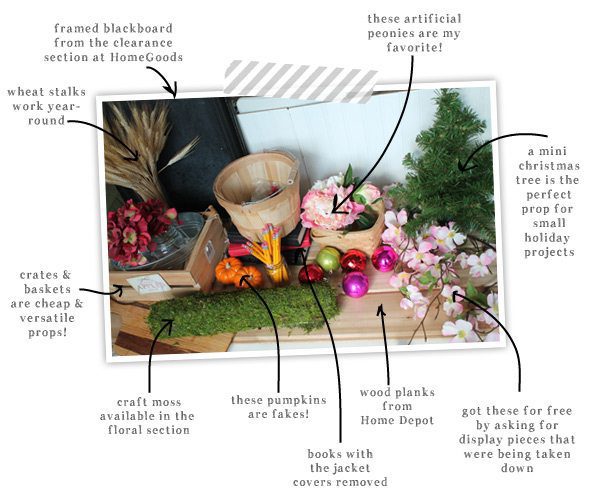 These are some of my most used props for blog photos. You probably recognize a few of them from photos on Damask Love. Generally, I take a four seasons approach to props. I like to have a few pieces that fit in each season of the year. My roll of craft moss and artificial peonies are perfect for spring. My pumpkins and artificial autumn leaves (not pictured) are two of my favorite fall themed props. Of course, there are also plenty of year-round props, like crates, buckets and my trusty chalkboard that comes in handy all of the time!
Click through to see the rest of the post and all the photos hat I have for you!
There’s a lot that goes on behind-the scenes of a blog photo. Personally, my photo shoots are a big mess…
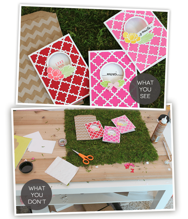
There is a method to the madness though…I promise! Here are a few of the things I consider when photographing for Damask Love:
 I am always fighting the urge to throw my favorite props into every photo. I have to remind myself that sometimes my favorite props don’t make sense in the photo. I try to think of the theme or spirit of my focal item and create a photo that jives with that theme. Here’s an example:
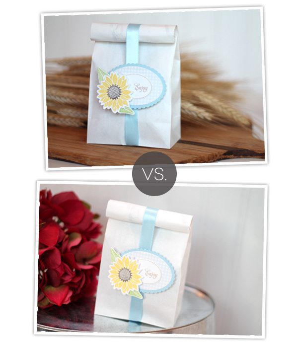 While I do love both of these photos, the springtime, country feel of the focal item makes more sense in the bottom photo. The wheat stalks in the first photo remind me more of a fall, rustic scene – so as much as I love them, I just have to save them for another photo.
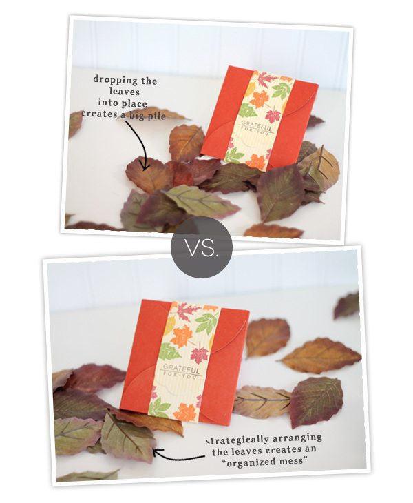
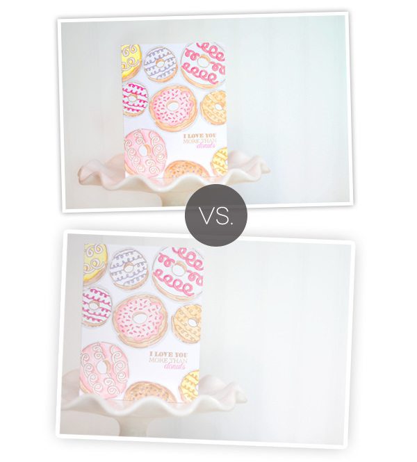
 I love the look of a little chaos in my photos. Makes them look a bit more organic. Confetti, for example, can look great scattered throughout your photo, but if you just plop it into the photo, chances are it will just look messy. This is your chance to “make” your own mess…
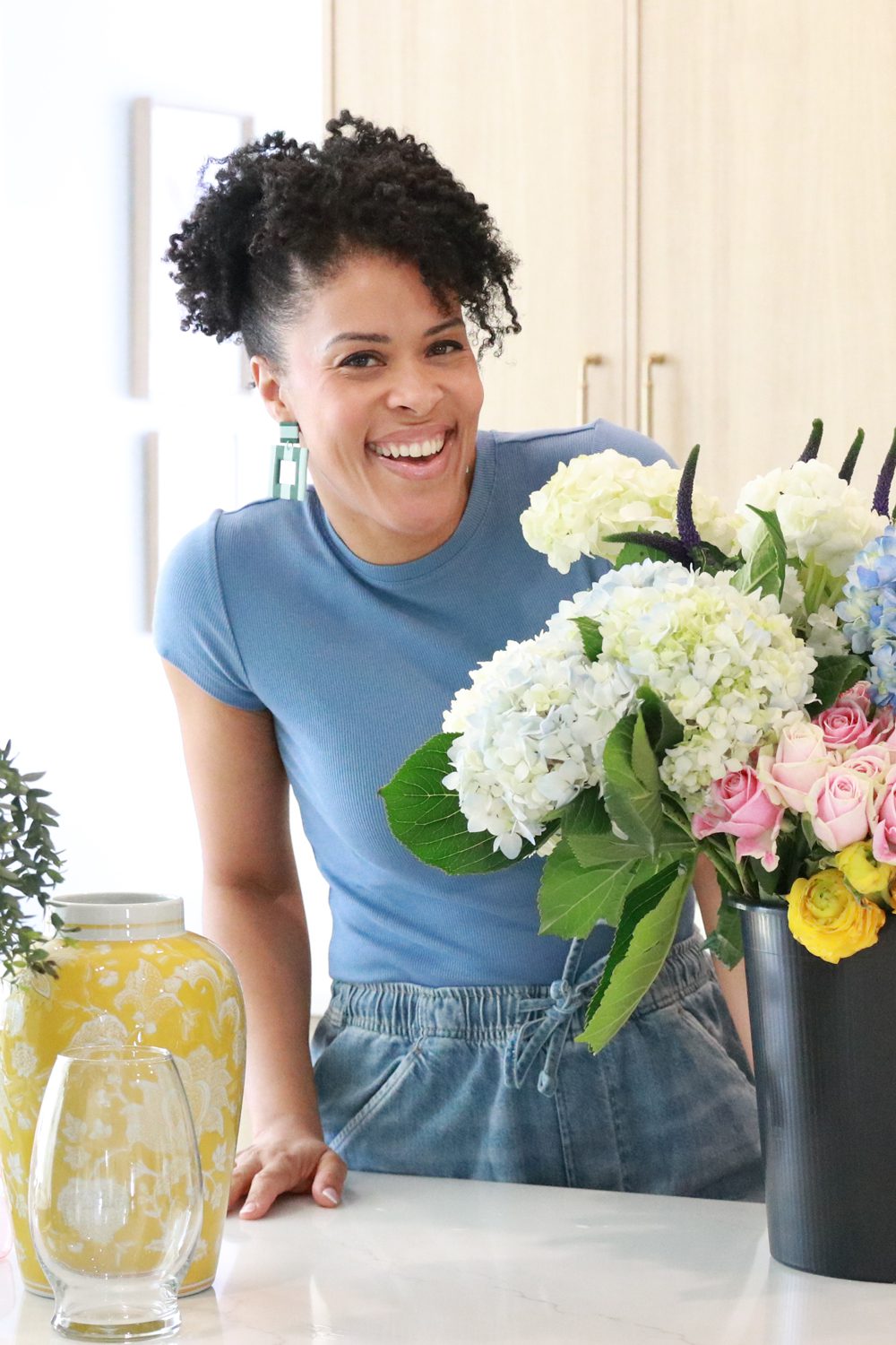
 You’ve probably heard the suggestion that you should include a bit of “nature” in photos. I love to do this with flowers or fruit. Even if they are artificial, they still give the look of something natural…something that “breaths.” You can take this to the extreme and include something that breaths…literally…yourself! Photos that include hands is a big trend in product photography, so I’ve just recently begun to consider it to be a useful approach for photos on Damask Love. Here’s a comparison….
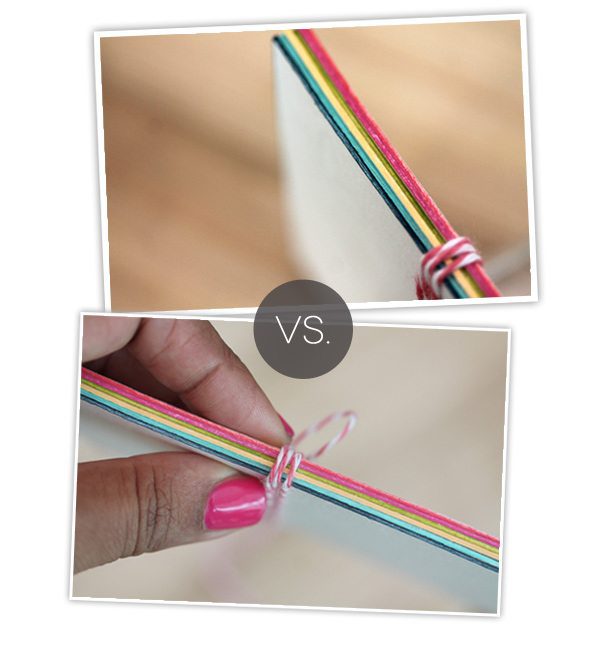 Both photos show the exact same product, but by including my hand in the photo, I can include a bit of “human-ness” to the blog and show that I’m involved in each part of the process.
 Adding a bunch of props to your already filled home may not be on the top of your to-do-list. I get it. A few weeks ago, I purchased some huge birch branches to use as props…and now we have a ginormous “tree” in the corner of the craftroom. There are plenty of options for props that you probably already own. Take a look around and see what you’ve got…use it…play with it and see how you like the result.
 There are tons of prop-tions (get it? Prop Options?!) – and once you’ve settled on the props for your photo, there are some things you can consider when it comes to styling.

 Anchoring the focal item can provide structure and contrast to the photo. I try to do this as much as possible. Even something as simple as a piece of cardstock can anchor your focal item.
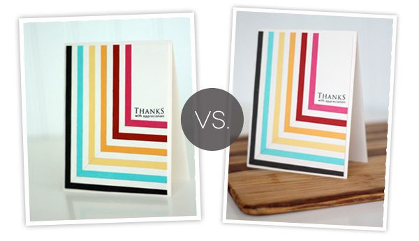
 This is one of my very favorite techniques for styling, and I didn’t even realize it until I studied some of my old photos. Chomping a bit of the photo can make things more interesting. To me, it creates an extension of the photo beyond what the eye can see. There is something “more” happening in the photo when it’s slightly cut off.
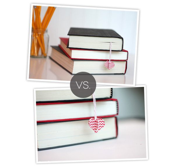
Cropping out part of the photo can also give the eye some direction about what to look at. In this photo of the books and bookmark, the first photo includes full shots of the books – and consequently the eye focuses on the books rather than the bookmark. By cropping out the books some, they are still recognizable, but the eye focuses on the bookmark first – which is the focal item of the photo.
 So – after sifting through two years of photos, I now realize that I do this all the time! If you take a browse through some Damask Love posts, you’ll notice this technique throughout.
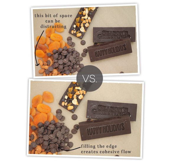
Filling the edge of the photo creates flow and continuity. There is a cohesive scene rather than a focal item that sort of floats in the middle of the photo. Of course, this is a matter of preference, but I really love the look of props that peek in from the edge of a photo.
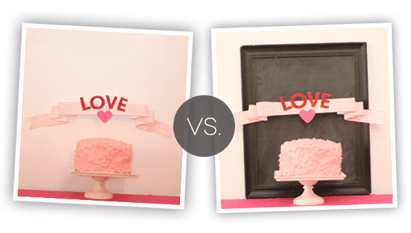
 Creating the “lived-in” look with product photos is the same idea that realtors use when staging a home. Creating a “lived-in” look gives readers a complete “idea” for the item in the photo. They can see what it’s for, they can begin to picture it in their own homes. The “lived-in” look gives purpose to the item in the photo.
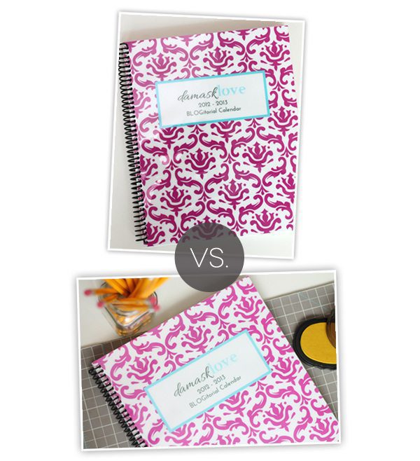
For this DIY editorial calendar project, the first photo does a great job of showing you the project, but there is something missing. By adding a few of my craftroom elements, the editorial calendar now has a “purpose.” You can see how I use it and begin to think of how you might use it, too!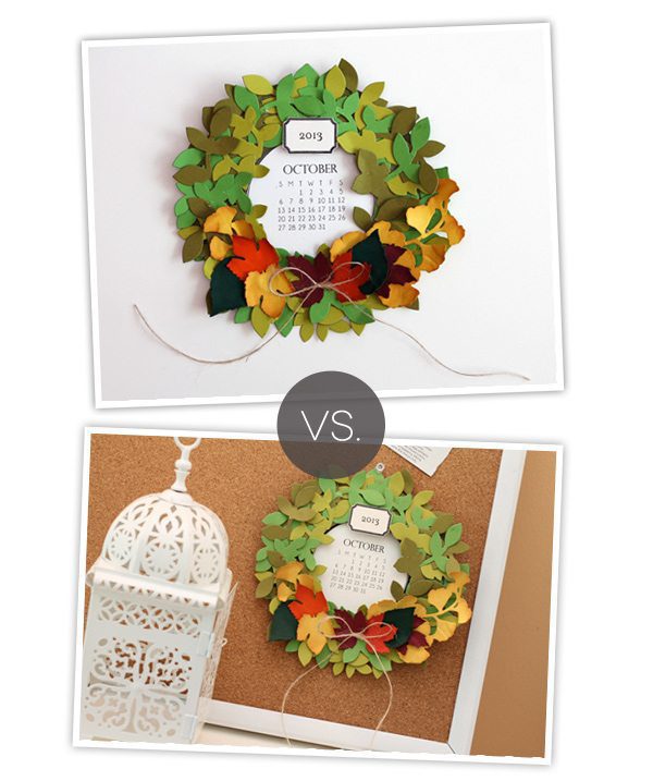
The same idea works for this wreath calendar. Alone, the photo allows you to focus on the details of the calendar – and of course this type of photo has it’s own important purpose…maybe for the tutorial portion of a post. The lower photo shows the wreath “in action” and allows readers to envision this project in their own space. There are all sorts of random tools you can use to give lift to your projects. I do this all the time. In the final photo, you don’t see all the elements, but they are very integral to the shot.
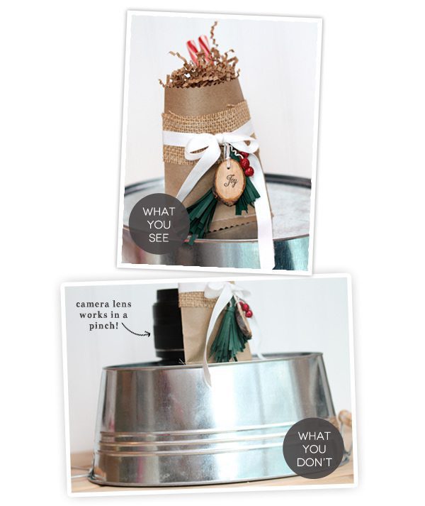
With this rustic holiday gift bag, I used a camera lens to prop it up. The final photo is much more interesting than if I simple photographed the bag laying down.
When shooting these tags, I used an acrylic block to prop up the middle tag. This adds depth to the photo and also tells the eye which of the tags to look at. If I had photographed this tag flat along with the other, the eye would focus on each of the elements equally. By propping up the yellow tag, it gets to be the star of the show.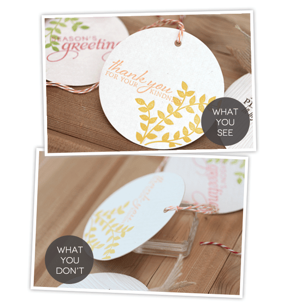
 {ASK!} Many of my props are items that I’ve gotten for free by simply asking! When I go to Pottery Barn or West Elm, I ask about the props that are being used in displays. Sometimes, the employee or manager will tell me that the display is being dismantled and I can come by to pick up some of the elements in the display! SCORE! Give it a try – of course you may get some crazy looks, but it has worked for me and it can definitely work for you!
{OVERHEAD SHOTS} Straight on shots from over top the focal image are popular in blog photography. I use them a lot for my cards as well as photographing the supplies in a tutorial or the elements of a card kit. One thing to remember when doing this: make sure all the items are lined up neatly! One slight tilt or item out of alignment in a row will jump out in an overhead photo.
{THE LIVED-IN LOOK FOR STATIONERY} When photographing cards, you can create a “lived-in” look by simply adding an envelope to the photograph. I do this in many of my photos and I think it creates a complete package and show exactly how the card can be packaged up and given away to a friend!
Thanks for making it through today’s post! I hope it’s been helpful and that you’ve picked up a tip or two that you can put to use in your own blog photos!
ETA: 6/19/2013
{HOW TO USE THESE TIPS}: The content of this post is intended to serve as instruction and inspiration for your own blog photos. It is not permission to duplicate the photo styling that you see here on Damask Love. I work hard to produce photos that are identifiable and represent this blog. Thanks!

- Love the comments on “cropping clearly” in this post on DesignSponge
- Take some time to visit the great links in this post from Decor8
- Centsational Girl offers many of the same tips that I mention here, along with some additional ones that you’ll appreciate.
- $15 will buy you an hour with super-duper photographer Justin Hackworth who is partnering with Alt Summit to offer a class on how to take photos for your blog. The class offers plenty of time for asking questions, which I love.
- Pencil Shavings is a great blog…only made greater by this post all about styling products for photography.
Another fabulous post. I learn so much from you. If I ever meet you I’m buying you lunch or dinner. Thank you SO MUCH for all of the time you put into these posts. I’m going to use this info for my next blog post.
Great tips, thank you!
Wow, such a great post. I’m just off to take some card photos for my blog and have already set up a little table infront of the window and have my white mount board to hand…now to find some props!!
I found your blog a few weeks ago (I think through your love ribbon banner on Pinterest via Tomkat Studios) and added you to my bloglovin list of daily reads. I am thoroughly enjoying your blog and have gotten so many helpful tips and fabulous ideas. I love, love, love this post and can’t wait to stock a prop closet.
YAY! I love hearing about how people made their way to Damask Love! So happy to have you in the “family!”
Thanks for sharing so many fab tips with us and I love the visual comparison shots.
This is a great post! There’s a ton of info here. I think it’s interesting the difference in individual thinking though. When I saw your first compare and contrast photos (the sunflower card) I was thinking how much more suitable the wheat stalks were, because the card looked to me very much in the farmhouse style. I was thinking less seasons and more style, and in my head the wheat stalks suggested the country or a farm. All in what you want to portray I’m sure!
So funny! I never thought about it that way but you are totally right. Wheat stalks are very “farmy!” I guess either one of those photos can work, huh?
Funny to read this cuz I saw a sunflower on the bag and thought the wheat was perfect. Aesthetically it pleases my eye more too 🙂
That’s what I thought too, Caryn! Sunflowers and wheat are country and compliment each other.
AHMAZING Post Amber!!! I love love love the vs. photos and the time you put into making this so informative!! What great info! I showed your lighting and set up post to my hubby, who liked it a lot! I’m off to the supply store to get board and the hardware store to get some more lights!
Now, I need to add some more props! I love your props! They’re great!
Amazing tips! Thank you so much for sharing your ideas with us readers! I have learned so much from you and your blog. And this post was one of my favorites! Thank you!
Yay! Thank you! Thank you! I’m already planning on heading out to some stores to buy props. Hehe. 🙂
Such Great Info…Thanks for sharing. I will certainly be trying these techniques the next time I photo my craft project.
Amber this post is full of so much fantastic information. Thank you for taking the time to put this together for us, your loyal readers 🙂 I’m off to check out the links you also included. You totally rock!
Wonderful post, Amber – thanks for the very useful tips!
GREAT tutorial Amber! I struggle with prop vs non-prop but I think I will challenge myself with setting up some props.
Ellen
Great post Amber. Will definitely have to put some thought into making my pics more interesting. You know, once I get the lighting issues solved and get a macro lens. One step at a time.
Very interesting and helpful, Amber. I love how you share your thought processes as well as technique. You are a natural and gifted teacher. Thanks for sharing!
Wow, best post ever! Seriously, the photo series has been great, but I can’t believe how many great tips you’ve packed into one post. Thanks *SO* much for sharing!
Thank you so much for this post…I really learned a LOT!!!
You are such a wealth of knowledge. Thanks for sharing it!
Amazing, Amber – fascinated by all the information, and the pretty images – need I say more……….
Hi Amber,
This is my first comment on your blog. Thank you for being so helpful and generous with your skills!!
I am starting my own online shop and I struggle with product photography. After reading your posts, I think that I can use many of your tips and ideas for photographing my products.
Please can you share tips for photographing scrapbooks? I make baby albums and I find it difficult to get good photos of all the little details.
Gosh, thanks Amber for all of these wonderful ideas for photography for our blogs. You are so very kind to share all these tips. I saw your post as it was featured over at “Serenity Now”.
Amazing post, so full of ideas! Kind of makes me embarrassed that my latest post has a picture from my kindle in it. Lol.
I am SO HAPPY to have found your blog. Firstly, it is beautiful! It’s also informative and well written. Thanks for sharing your knowledge with the world! I’m so excited to be following you 🙂
Love these tips. Some of them I’ve tried, but others are new to me. Can’t wait to try them!
I just found this post and it is PHENOMENAL! Probably the best collection of photo staging tips I’ve read. Thank you! I can’t wait to start collecting some props!
Neat little tricks that otherwise seem not essential but totally bring the picture together! Your photographs are beautiful!
Great tips! I have no clue about this sort of thing, but wish I did – you’ve done an amazing job of putting together such a cohesive list of tips. I’ll definitely try to implement them in the future!
Do you have to rely on your country to give you something all the time, think out of the box and improvise on how you would earn more than what employment can
offer, CNBC investing may help. This was exactly in the 6th day of august, in 1990; which marked the
fourth day after their Iraqi invasion of Kuwait.
The unique design of the Beetle caught the attention of millions of people of different age groups all across the Western
countries and continued its successful run through decades.
Great items from you, man. I’ve be mindful your stuff previous to and you’re simply extremely excellent.
I actually like what you have got here, really like
what you are saying and the best way by which you say it.
You are making it enjoyable and you continue to care for to keep it wise.
I cant wait to learn far more from you. This
is actually a wonderful website.
GREAT post! As a fellow blogger, this is something I really have to work on and your tips are amazing! 🙂 Pinning for future reference!
I know this website gives quality dependent posts and other data, is there
any other web site which presents these information in quality?
Wow plusieurs bonne connaissances.
Hi it’s me, I am also visiting this website on a regular basis, this
web page is truly pleasant and the visitors are in fact sharing nice thoughts.
Appreciation to my father who shared with me about this blog, this weblog is
really awesome.
Can I inquire if you’ll be alright with paid off blogs?
All I would require is for you to write subject material on behalf of me and also a link or mention of my blog site.
I could pay you.
Hello I am so glad I found your blog page, I really found you by error, while
I was searching on Google for something else, Anyhow I am here
now and would just like to say thanks for a remarkable
post and a all round thrilling blog (I also love the theme/design), I don’t have time to read it all at the minute but I have saved it and also added your RSS feeds, so when I have time I will be back to
read a lot more, Please do keep up the excellent job.
love this post!
This is such a fab post – came across it by chance and have now saved it to my favourites and have emailed it on to another blogger in the wedding industry who I know will appreciate it too!
xx
Wonderful post, thank you!
Thank you for these helpful tips! You may want amazon product photography service. Please visit the site here: http://bit.ly/2pvojLF
Everything we need to decorate in our photos exactly how we would like them to be sent to our customer. Thanks for sharing. I found this page, helpful https://clippingpathindia.com/blogs/tips/how-style-product-photoshoot-diy and I did a bunch of other searches. I believe my blog photos need any special effect.
The clipping path service related content is extremely useful. I have delighted in it a ton and got more data about the cut-out way administration perusing the article. You rock for offering to us.
Thanks for sharing these tricks. It was very effective for me.