The magic happens post-production. That’s my attitude about blog photography. I’ve heard many other bloggers say that they never go into a shoot planning to making edits to the photos. I wish I was that good. I’m not. I know that almost every photo that I take will need to be edited. Sometimes I get lucky and the photo doesn’t need much help – but usually it does. As a result, I have a pretty systemized, albeit, simplistic routine for editing my photos.
Today, we’re wrapping up “The Non-Photogs Guide…” with what is perhaps the most blasphemous of all the posts in this series. I’ve said it before, but I’ll repeat myself – if you are a professional photographer or if you have a reasonable knowledge of photo editing techniques – I suggest you turn back now. I am neither of these things and I am probably doing this all wrong…but I’m cool with that. In the end, I just want photos that look pretty to me. With that disclaimer out of the way, let’s get started.
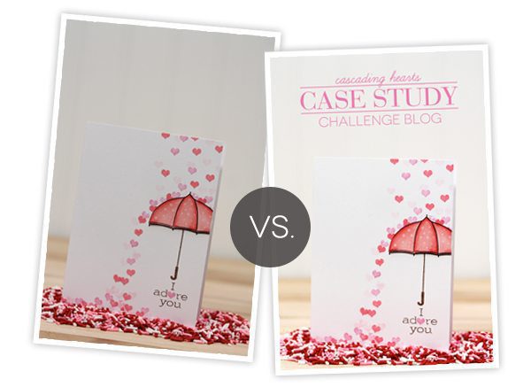
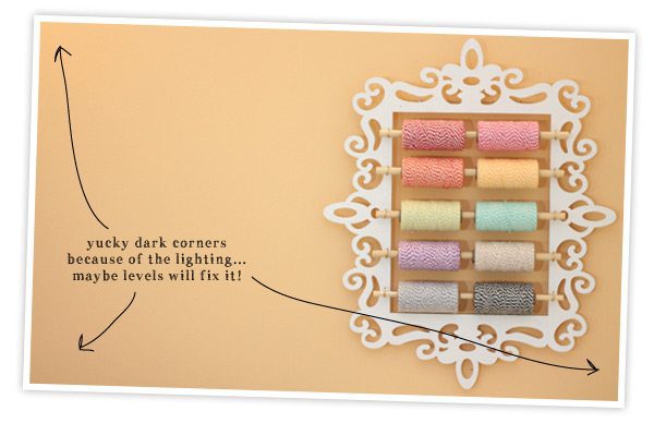
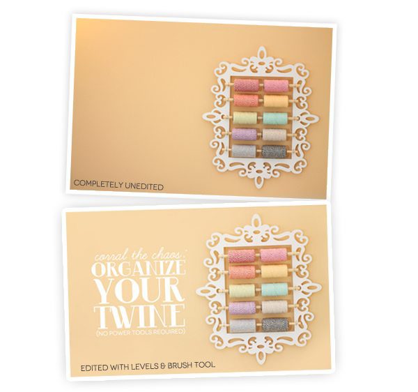
Here’s an example of what editing does for my photos. What first looked like a good photo, looks dingy, muted and overcast once the editing process is finished.
 Click through for the full post on editing!
 I use Adobe Photoshop and Adobe Illustrator Cs4 for all of the photo editing and graphic design that you see on Damask Love. In today’s post, I’ll be referencing Photoshop CS4 and all the tools that I use within this program. Of course, this will be directly applicable for those of you who also use Photoshop. If you use another editing software, I hope that you’ll find this information useful and can translate it into your own programs.
  My preference for all the photos on Damask Love is to err on the side of bright and maybe even a little overexposed, with moderate saturation. To my eye, that is more visually consistent with the look my blog and the photos look “at home” when they are very bright white with vivid colors.
Each time I open a photo in Photoshop, the very first thing I do is work with the “Levels.” (Image>Adjustments>Levels). Here’s the lowdown on “Levels.”
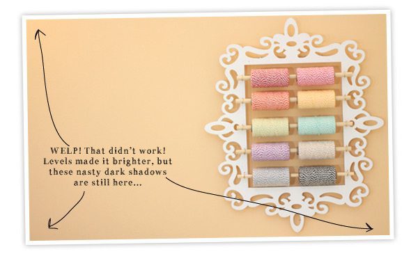
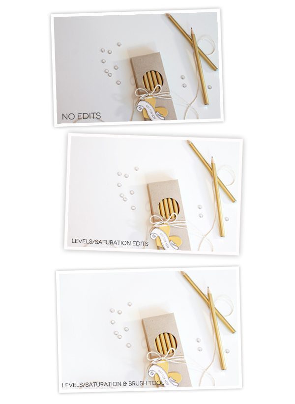
Levels refer to the range of white, black and midtone colors that exists in your photo. Ideally, the histogram in your Levels window will span all the way from the black slider, all the way to the white slider. For me, this rarely happens – so I have to adjust the sliders. I usually start by sliding the black and white sliders to the edge of the histogram and see what happens. As long as you have the “Preview” option checked, you’ll be able to see your changes happen live as you make them.
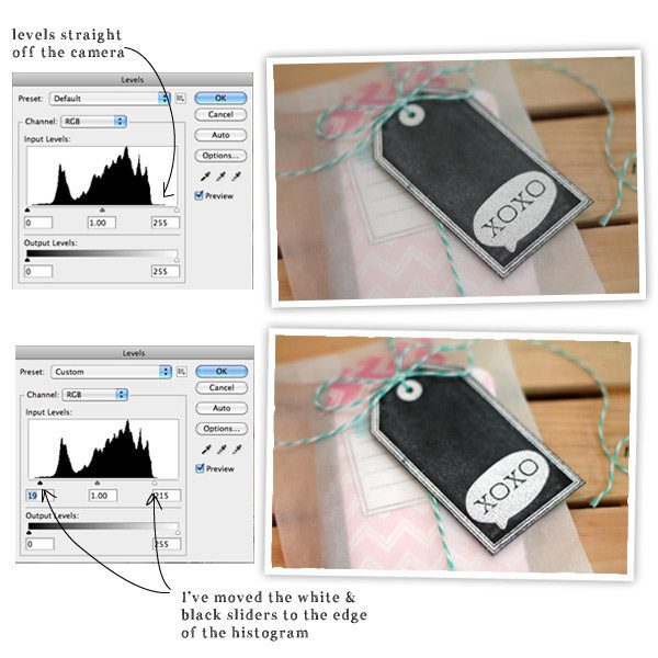 You can see, that in the second photo the black of the tag is darker, the white is brighter and the overall photo is more vibrant.
  Once I’ve adjusted the Levels, I usually move to Saturation (Image>Adjustments>Hue/Saturation). I think of Saturation as the “er” tool. Not every photo needs more “er” but I like to add “er” to many of mine. What do I mean by “er” ? Saturation makes reds redder, greens greener, yellows yellower…you get the point. Saturation makes colors more…well…saturated. A word of advice about Saturation, don’t go nuts. Too much can make your photos look radio active. With that in mind – have fun with it! I found the Saturation tool especially useful for the Superhero Party I hosted. In this case, the colors needed to be super vibrant…
 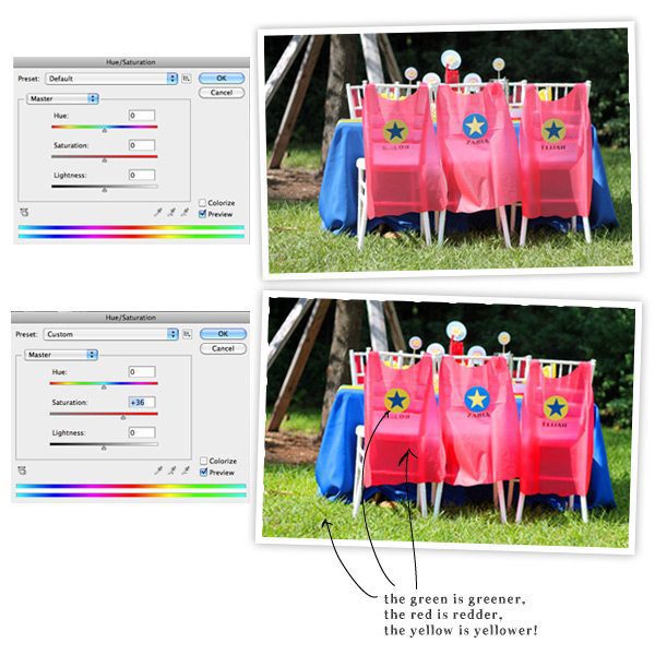 For this photo, I jacked up the Saturation slider to +36, which is much higher than I usually use, but it works for the purpose of this photograph. Superheros don’t like dull colors. Thanks to Elena for her tip on this.
 My adjustments to each photo usually only include levels and adjustments – I find that this gets me to where I want to be. A bright photo with vivid colors. Every so often, I break out the brush tool for a little airbrushing to remedy uneven backgrounds that result from uneven light. Here’s what I mean:
For this airbrushing technique, you’ll need three items from your tool palette in Photoshop: 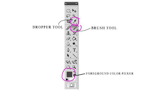
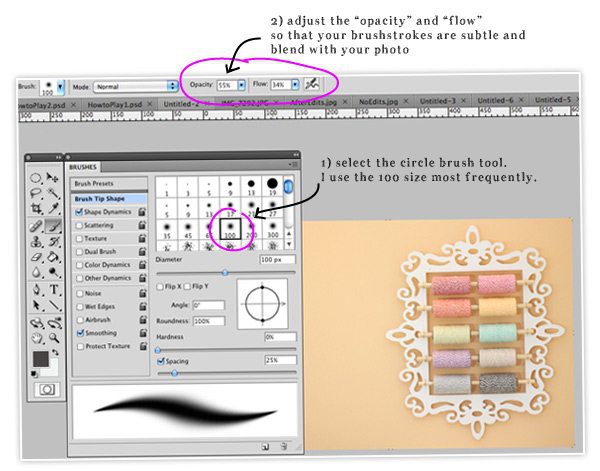
{1} Access your “Brushes” toolbar (Window>Brushes) and select the brush shape you will use. I work with larger sizes, the blending is better that way.
{2} Adjust the “Opacity” and “Flow” – I usually set Opacity to 55% and Flow to 35% or so. Doing this allows you to create subtle brushstrokes that will blend and look natural in your photo.
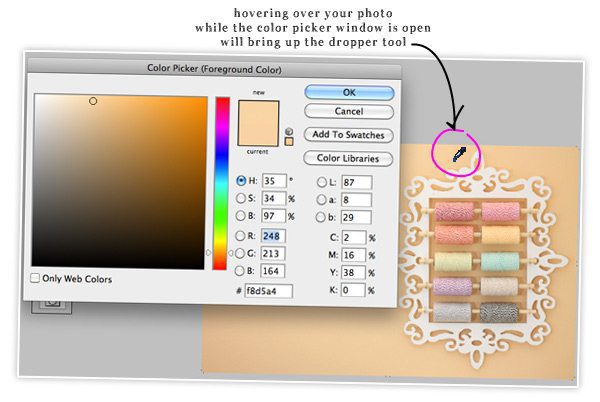
{3} Click on the Foreground Color Picker on the tools palette to bring up the selection window. With the window open, hover over your photo. This will bring up the dropper tool. Use the dropper tool to select one of the lighter shades in the background in your photo. By simply clicking on it, the dropper tool will “suck up” the color you chose and apply that as the foreground color. By doing this, you have now chosen the color that your paintbrush will apply when used.
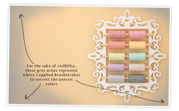 {4} Create a new layer (Layer>New>Layer) and apply your brushstrokes to the areas that need correction. You can go over areas that need more coverage and use quicker movements to blend. You’ll see it come together as you go, and if the color doesn’t look quite right, return to step 3 and select a different color.
 Here’s another example of this same approach with a white background that was not so white at first…
 So your photo is done and ready to make it’s blog debut! It’s time to save it properly so that your readers won’t be waiting forever for the photos to load.
You’ll want to save your photos for web (File>Save for Web & Devices)…
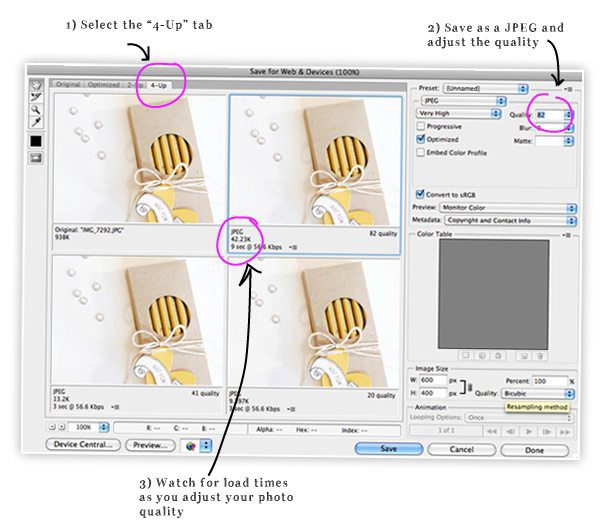
{1} Once you access the “Save for Web & Devices” window, select the “4-Up” tab. This will bring up four images of your photo – each with a different quality. This will allow you to see the visual differences in quality ratings.
{2} You’ll now want to select JPEG as the type of image, then adjust the quality. I used to think that all my photos had to be 100% quality, but turns out that 100 looks just the same as 80…and 80 has a much lower file size and load time.
{3} As you adjust the quality, you will see the specs on your photo change. You’ll be able to see how it compares to the original file and what the load time will be. The goal is to find a balance between load time, quality and size. I typically keep my photos in the 70-85 range and that works well…your server will thank you for not overloading it! (I learned this the hard way!)
PHEW! And so ends our little (not-so-little) lecture on blog photos…from a girl who doesn’t really know a ton about photography. This is just how I do things around here…I hope this has been helpful!
Now..what shall we tackle next? Let me know your ideas for the next Office Hours!
Thanks for sharing. Information overload 🙂 But your photos are always great so it’s obviously worth the hard work.
Yeah – it seems like a ton of information and when I list it all out like this, it definitely seem like a huge amount of work! I promise you though – everything I listed in this post takes me about 2-3 minutes per photo. Once you get into the habit, the process goes very quickly!
nicely done! I think you gave tips and tricks that are very accesible!
WOOHOO! I am so glad you approve!
Thanks, Amber! I’ll try these tips out next time I’m editing a photo for my blog. I may get more out of my PS with this little bit of knowledge. 😉
Thanks so much for sharing this info, I could bake you a cupcake for your kindness, : )
Red Velvet?!?!?!?
Amber, you’ve inspired me to look more closely at the options in PSE and to explore more with it. Thanks for all the wonderful tips.
This has been so helpful! Thanks for sharing!!
Amber – you are SO good! Awesome tutorial. First time I’ve used any of these things in fine tuning my photos. I just tried it on the awful photo I submitted for the CSS challenge and it helped some. I need to work with it more to know how it works for me. Thank you, again. I APPRECIATE you so much.
Sue – I appreciate YOU so much! Seriously! Your comments always make me smile and I love that you are a regular reader! Thanks for being so awesome and supportive!
Thanks so much, Amber. The photo editing has always been a bit of a big question mark for me. Thanks for explaining what you do in layman’s terms and with the photos illustrating your steps. I’m not a pro and I don’t intend to be a pro – I just need my pics to look good. 🙂
I am right there with you! I have no intentions of being a pro – as long as the photos look good to me, I’m happy!
Amber, Your tutorials are always so thorough! Thank you for all the time you put into them. You wanted suggestions on your next tutorial…how about how to make a blog! I have been wanting to get one going but didn’t know how or where to start. Thanks.
What a great idea for a series! I never thought about it before, but I’m sure it could be of interest to lots of people!
I love you for this!
OMGOODNESS!!! You are AMAZING!!! I have been struggling with how to get rid of the gray edges in my photos and you have just solved my problem!! I am soo soo zoo stoked to try this out! Thank you Amber!
You are the bestest, bestest, bestest!
Thanks a million. Just love your blog.
I’ve no excuse now. Just got to try all those tips.
You are so cute! Thanks for thinking I’m the bestest! Readers like you and comments like this totally make it worth it!
This was so helpful, Amber…thank you!
This series has been one of my favorites! I have learned so much from them and I think my blog has really began to shine now that I have a better understanding of how and what to use! I would love to see maybe a whole series on organization… I’ve seen you dabble here and there with ideas and tips, but maybe a more indepth look? Thanks so much!
Thanks for this suggestion! Ever since I read it this afternoon, my brain has been swirling with ideas for a more in depth series on craftroom organization!
Thank you so much, Amber, for sharing!! Very useful tips! I’ve always loved your photos and wanted to make my photos look as beautiful as yours. All your tutorials have been very helpful. THANKS!
Thanks Amber your photo tutorials have been really helpful. I use Photoshop Elements and can recreate a lot of what you introduced today!
The post I’ve been waiting for my whole (blogging) life! 🙂 Seriously, this has helped me tremendously! I use a free editing program called Gimp that someone told me about once and they showed me 2 things to do on it (that’s all they knew), which helped my pics a little, but I was able to find all these things you talk about in Gimp and use them and it’s awesome. I’m so stoked to post more beautiful pictures to my blog now! Thanks Amber!
oooh! Thanks for this feedback! I was worried that these tips wouldnt be applicable to other programs so it’s great to know that you can translate this to the software you use!
Great post, Amber! You made some fairly technical stuff very understandable and accessible. Thanks!
What an awesome compliment! Thank you. I did my best to make everything clear and understandable – good to know that it worked!
Amber, This post helps so much. Time for me to try it on some of my photographs. I would also love to learn more about how you make the arrows in your posts {your layouts are spectacular}. Many thanks.
Hey Audrey! I’m almost embarrassed to tell you how I create those arrows. I just draw them with my finger directly onto the photo. It usually takes me about twelve tries per arrow to make sure they don’t like all jagged and weird!
Woweee – what an amazing post, Amber – loaded with very understandable information – thank you 🙂
I love seeing your name pop up! You always leave such sweet comments – thank you for that! I am so happy that you found this information useful!
Wonderful!
Amber you are the bestest!!! 🙂 I have been trying out what I’ve learned from this series. I’m sooo nappy with the results!!! As for the new topics…how about how to design a blog layout?
Whoo hoo! These tips are awesome, especially the brush for those dark corners. Thank you for taking the time to put this series together it was awesome! Now I just need to know where the button is to make me look skinnier in photos?
Totally enjoyed this series, Amber! I haven’t bought the software yet, but I am currently using Pixlr from Google. It’s not bad considering that it’s hosted from the web.
Wow! What a detailed post. I’m always looking for new helpful tips with blogging. Thanks for sharing your knowledge and talent!
xoxo,
Jules of Canines & Couture
Oh keep doing this little series, Amber! I just downloaded the GIMP photo-editing program and I have no idea what all those buttons are for 😉 This is a great start!
Thank you! I’ve been messing with levels, but not saturation – will definitely be trying that. And airbrushing the background – genius!
Thank you, thank you for sharing these little tips. I never used the brush tool to even out the colors and can’t wait to try! I am so excited to read of your *simple* tips for editing!
Anne @ circusberry.wordpress.com
I just fell in love with you a little bit more! LOL THANK YOU THANK YOU THANK YOU I really needed a post like this. Understanding software like Photoshop can be a bit overwhelming. At least, it is for me! I’ll start saving for a new camera too. I do need it. Your pics are always so great. Again, THANK YOU 😉
thank you so so so so much for this mini series, I’ve found it so helpful and hopefully some of these ideas will help my blog be more beautiful! I use Digital scrapbook artist to edit my photo’s, so will have to play around a bit to get the similar effects!
You have no idea how useful this whole series was! I just sat down this afternoon and devoured all the posts! now I need to try some of your tips! Thanks so much! 😉
Thanks so much for this. I have just started a blog and this information was really helpful. My photo’s are always a little bit dark, so now I know how to go and edit them a little…
thank you sooo much for this!
xo julesinflats.com
Great tips! I was using levels and contrast a lot but I never thought to use the brush tool! Thanks for sharing!!
These are really good tips Amber! Nicely illustrated with screenshots also. As a professional photographer myself I can say you’ve provided a very good breakdown, as you say once you build these things into your workflow you get quicker.
Two things I would add:
Learn the basic keyboard shortcuts, which are transferable across many softwares and will save you a lot of time. On a Mac use the ‘cmd’ key and on a PC use ‘ctl’.
For example ‘cmd l’ = Levels and ‘cmd m’ = Curves and ‘cmd u’ + Hue/Saturation.
Also when saving for web, watch out for changes to colours, especially in the red spectrum. You can preview/edit these changes in Photoshop before you go to save for web, google some tutorials on this..
I’ve recently started blogging about my craftroom shenanigans. As a beginner blogger I found this series (and especially this article) is golden advice. Thank you for sharing your knowledge and experience.
Sometimes, you can easily solve these problems by sending your photos to free services like reddit.com or merka.to.
Could you also make a tutorial on how you put those text on your pictures. Great tutorials, THANKS 🙂
Hi Good information.. Thanks for sharing the information.. I want suggest outsource image editing services. They are offering all the professional photo editing services within a fast turnaround time.
Outsource Image Editing
Thank you for this wonderful tutorial. I was searching for this topic. At the end, i found here.
Woo its really awesome, I have also a blog site and I want to, may I use the method or tricks on my blog site? Waiting for your answer.
I have read your blog post and it was really helpful for me. I will definitely visit your blog again for read more contents. I will also share on my social media page of any helpful post 🙂
Wow these is awesome tutorial! Very very useful for sure.
thanks for The advantage of this system is the possibility of creating extremely larger.On is customary to say that the only limit is its own créativité type of online free photo edit website is preferred for those who want to create collages or embellish their images.
Skype has established its web-centered buyer beta for the world, right after launching it
broadly inside the Usa and You.K. previous this
30 days. Skype for Online also now facilitates Chromebook and Linux for
immediate online messaging connection (no video and voice yet,
these call for a plug-in installment).
The increase in the beta brings assistance for a longer list of different languages to help you reinforce that worldwide user friendliness
Thanks for sharing such a relevant guide on Image editing will definitely try this for better result..
Nice post
Really great tips, I got A to Z photo editing information I really enjoy this article.
thanks