“Excited” doesn’t even begin to describe how I’m feeling about today’s Style Watch post! Usually, when I sit down to create for Style Watch, I have a plan in mind and begin to execute my design as soon as I nestle into place at my craft desk. For today’s projects, I didn’t have a plan … I just grabbed my stamps and played around – it was a lot of fun.
After a couple of hours of playing with the newly released Triangles Plus and the Shapes: Triangles dies – I had a pile of geometric designs ranging from whimsical to contemporary – who knew that triangles were so darn versatile!!
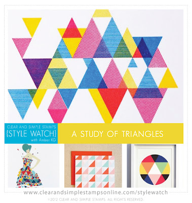
So, today I get to share all my creations with you in a little “Study of Triangles.” I’ll share some tips and instructions along the way – hope you enjoy!
Take 1:
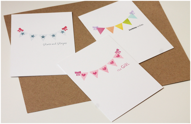
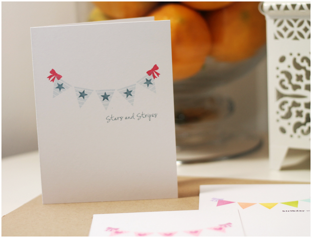
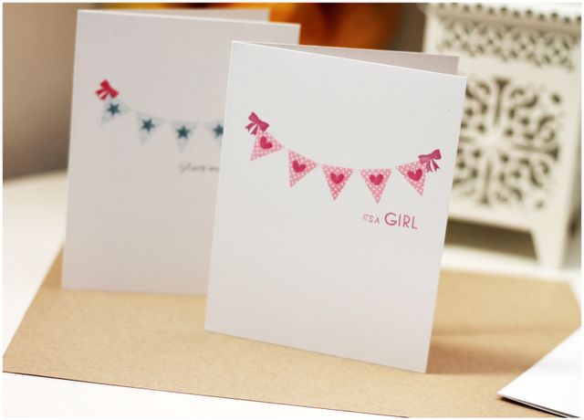
You can never go wrong with a banner!
A simple line of upside-down triangles creates a quick, easy and super adorable banner. The little bow image from Cart Parts offered the perfect ends to my banner. With a simple change of color combo – you can make a banner for any occasion! These cards are really easy and perfect for mass production!
Take #2:
Create an Image
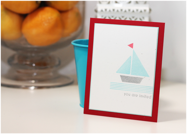
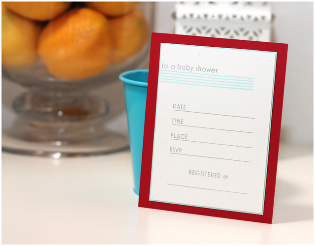
Triangles as triangles? That is so last season. Triangles as a sailboat? Yep – that’s the hottest trend! For this guy, I used different sized triangles for the mast and flag of the boat…then for the bottom portion, I simply masked the tip of an upside down triangle to create the bottom of the boat. I love the modern look of this! Again – this design is great for mass production and would make for a really cute baby shower invitation!
Take #3:
Patterns, Patterns & More Patterns
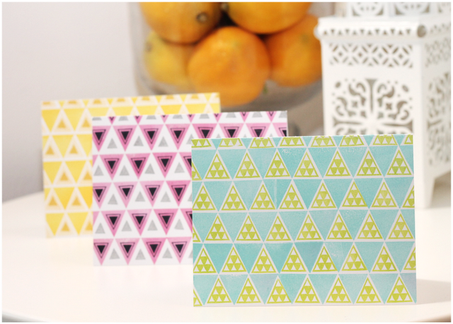
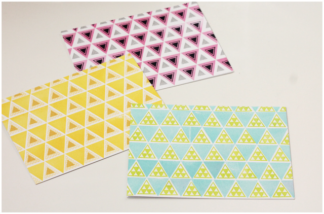
There is no rule that says you need to stamp a sentiment onto every single card. So, for this little set, I focused on fun patterns which were really easy to build using the background building stamps in the Triangle Plus set. Building patterns is a great way to play with new and different color combinations, which is exactly what I did here.Tie a little twine around these along with some envelopes and you’ve got a great stationery set ready for gift giving (I’m keeping these for myself though!)
Take #4:
Overlapping Die Cuts
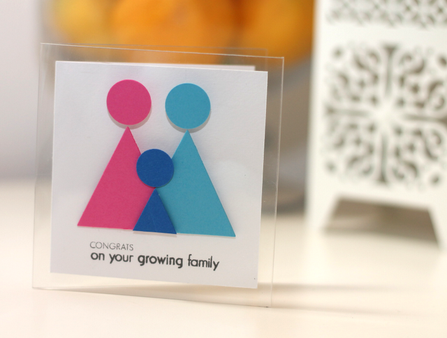
Overlapping triangles is such a cool way to build a modern and sleek design. For this card, I overlapped triangle die cuts to create an uber-modern baby card, which I mounted on a clear card base to drive home the contemporary vibe.
Take #5:
When In Doubt – Think “MOMA”
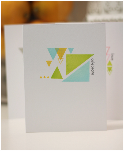
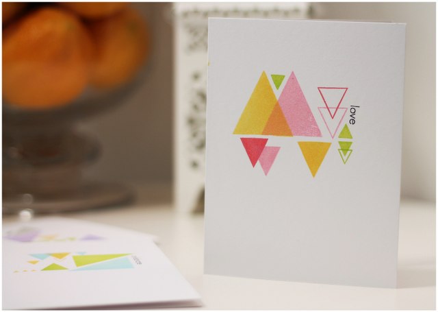
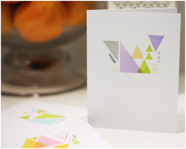
Imagine for a moment that you just got a phone call from the Museum of Modern Art. They heard about your awesome stamping skills and want to feature your work…what are you gonna do?! Here’s what you do: go grab your Triangles Plus stamp set and just start stamping. That’s exactly what I did to create this trio of abstract cards. I stamped a little here, a little there…stood back…stamped a little more. To finish each card, I stamped a single word sentiment vertically or diagonally to add something different and interesting. I’m loving these and really happy to add them to my stash!
So there you have it! Five projects. One stamp set! Hope you enjoyed!


You are very creative!
Awesome post, Amber.
Such Talent!
I love the idea for the banner. Definitely cute – I betthere are lots of decorative items like that out there that usually slip my mind.
I’ve never wanted a triangle stamp set until now. You make them look uber cool and modern. Love that.
Wonderful cards!
Awesome cards. You are so creative. Thanks for sharing your wonderful ideas.
Those are all truly awesome! LOVE!!!
wonderful cards Amber! Such creative uses of triangles. I love the banner cards…so nice! Have a great weekend 🙂
So many awesome ideas for a simple shape. So fun and “MOMA” WOW!!
Your cards are awesome! Amazing it’s only one stamp set =) great job!
Wow, brilliant stamping 🙂
fabulous. love love this.
Those “MoMA” cards? – Da bomb! Seriously, you’ve wow-ed me yet again! 🙂 Love them, very cool!
Best wishes from Germany!
Nina
OK, Amber, so now I want/need triangles added to my stamping collection. Each style is a WOW in its own way. Wish I could think out of the box like you do as you get fabulous results. WTG!
LOVE it!
Found your blog via the Ingenious Inking blog. LOVE your projects using triangles. Great colors, patterns, sketches, “art!” TFS. I’ll look forward to seeing more of your posts. 🙂
Thank you for the tips to help us with triangles in CSS style they look so beautiful and I will share this info with my friends and tell them to visit website here. I remember a website blog that really tells me a lot about the fascinating culture around the world their blog is soo interesting and have soo much information I suggest you all to visit this website here.
Delving into the intricacies of CSS styles, particularly the study of triangles, can be a fascinating journey for web developers. College life, where such topics are often explored, can present its share of challenges. If you find yourself struggling with programming homework assignments, consider seeking online assistance from https://cwassignments.com/engineering-assignment-help.html specialized services. My time in college taught me the value of utilizing such resources when needed. They can provide valuable insights and guidance, ensuring you overcome hurdles and achieve a better grasp of complex concepts.
I liked going to school and I even miss this time a little. The only thing that brings back negative memories for me are the endless essays that I couldn’t stand.
How does your writing process work?
rate canadian pharmacies
http://expresscanadapharm.com/# Express Canada Pharm
canadian online pharmacy reviews
They have strong partnerships with pharmacies around the world.
where can i get lisinopril pill
Always professional, whether dealing domestically or internationally.
Global expertise that’s palpable with every service.
gabapentin acute pain management
Their compounding services are impeccable.
Leading the way in global pharmaceutical services.
gabapentin tablets 300 mg
They consistently go above and beyond for their customers.
Their global distribution network is top-tier.
buying cheap cytotec without rx
Consistent excellence across continents.
Their commitment to international standards is evident.
buying generic clomid without a prescription
They provide international health solutions at my doorstep.