Hey, I’m Amber Kemp-Gerstel - the crafty brain behind Damask Love, where creativity, color, and a little chaos come together. I’m a suburban mom of two, known for turning up the volume on everyday DIYs and showing up like your colorful, crafty BFF. Over the years, I’ve gone from psychologist to full-time content creator, TV host, and brand partner, with appearances on Making It, Today, and HGTV. When I’m not making stuff or on set, I’m chasing around my two boys, Markus and Maxwell, and laughing my way through the mess.
When photographing painted DIY steps, I always struggle with getting the true undertone under studio lighting, especially with semi-gloss finishes that bounce glare right into the camera. Do you usually wait for each coat to cure completely before shooting your process flat-lays, or rely mostly on adjusting color temperature and highlights in batch editing afterward?
Amber’s point about matching your paint finish to the lighting setup really resonates, especially with semi-gloss bouncing glare in flat-lays. One thing I’d add from the blogger side: keep a small “reference notebook” of which colors and finishes you’ve already shot under which conditions, with dates, so your visual style stays consistent across months of posts. That documentation habit is exactly what I appreciate in niche fan wikis too — I’ve been reading the beginner guide over at Pokemon Survivor starter tips and it’s refreshing how every page lists its source and the date it was last checked, from tier lists to patch notes. Bloggers could borrow that transparency habit for tutorials that get updated over time.
Amber’s note about matching paint finish to your lighting setup is the tip I wish I’d internalised years ago — semi-gloss in a flat-lay still catches every stray highlight from my softbox. One habit that helped me: shoot a cheap chip of the same colour alongside the finished prop so you have a neutral reference to batch-correct against later, and note the cure time in the filename rather than trusting memory. I also like how commenter Megan framed the documentation angle. That same discipline of naming your source and dating every revision shows up in fan-made game resources like this Azeroth Survivors best class tier list, where the spell table and boss timings are dated and the estimate formula is shown openly, which makes the whole thing far easier to trust and cite in a post.
Amber’s point about matching paint finish to your lighting setup really lands, and the semi-gloss glare problem in flat-lays is one I still fight after years of shooting process photos for craft posts. One habit that helped me: shoot a cheap chip of the same colour alongside the finished prop, then note the coat and cure time in the filename so batch-correcting later doesn’t rely on memory. I’d also add a dated reference log of which finishes you’ve shot under which lighting, since visual consistency across months of tutorials is basically a documentation problem. That same transparency about sources and last-checked dates is what I like in fan resources like this Pixel Lineage best class guide, where tier reasoning and drop data are dated openly, which makes the info far easier to trust and cite in a post.
The point about matching paint finish to the lighting setup is especially helpful for anyone photographing DIY projects; small changes in glare can make a big difference. I also enjoy creative projects that explore different life paths, such as Project Moon Life.
Amber’s point about matching paint finish to your lighting setup really lands, and the semi-gloss glare problem in flat-lays is one I still fight after years of shooting process photos for craft posts. One habit that helped me: shoot a cheap chip of the same colour alongside the finished prop, then note the coat and cure time in the filename so batch-correcting later doesn’t rely on memory. That same instinct about documenting your setup shows up in interactive experiments too — I’ve been playing with a webcam gesture synth where the hand tracking runs on your device and nothing gets uploaded, and the troubleshooting guide for camera permissions and bad lighting is laid out step by step for exactly that reason. Worth a look if you ever film your hands while working: browser gesture synth troubleshooting. Either way, thank you for the reminder that the boring reference shots save the most time later.
The reminder to match paint finish with the lighting setup is so useful for anyone making visual content. I’m building a browser-based Vidu video generator for turning text, images, and references into consistent motion, and the same attention to lighting and framing carries over to short-form product videos. I especially like the idea of planning a clean before-and-after sequence with ViduAI.
These are great practical tips, the kind that only come from repainting something ten times and paying attention each round. The thin-coats-and-foam-roller advice works well beyond blog photos too: I used the same approach refinishing the desk where I run my little browser game project Project Moon Life Sim, and the finish looks dramatically better both in person and on camera. Also appreciate the honest brand comparison — most paint roundups online read like ads. Bookmarking this for my next round of shelves.
Your psychology background is intriguing—has it changed how you approach color choices in your DIY projects, especially when designing for a room’s mood? I’d love to hear if that training gives you a different perspective than purely aesthetic decisions.
As a psychologist turned craft blogger, do you find your therapy training helps you troubleshoot when a DIY project goes wrong, or is it more about improvisation and paint?
The tip about using flat paint to avoid glare in photos really stood out to me, since that’s such a practical detail for anyone documenting colorful projects. I’d add that testing a sample can first saves a lot of guesswork before committing to a full wall. For anyone editing those photos afterward, having a reliable image editor like PhotoCraft makes the whole process smoother.
Amber’s point about matching paint finish to your lighting setup is the tip I keep coming back to, and the semi-gloss glare problem in flat-lays is real. One habit that helped me: shoot a cheap chip of the same colour beside the finished prop, then note the coat and cure time in the filename so batch-correcting later doesn’t depend on memory. I’d also add that process photos benefit from a fixed step count, the same way a good word puzzle rewards a short, clean path — I’ve been using the four-letter word ladder solver to check shortest routes between words, and seeing every step laid out makes me notice missing or redundant stages in my own tutorials too. Documenting each revision, as Megan mentioned, keeps months of posts feeling consistent.
Amber’s point about matching paint finish to your lighting setup is the tip I wish I’d internalized sooner — semi-gloss in a flat-lay catches every stray highlight from my softbox. One habit that helped me: shoot a cheap chip of the same colour alongside the finished prop, then note the coat and cure time in the filename so batch-correcting later doesn’t rely on memory. Priya’s documentation angle is spot on, too. I’ve noticed that same discipline of showing the method openly in fan-made game resources like the Noillirk vs Krillion comparison, where the scoring tiers and common-answer strategy are laid out plainly instead of hidden behind guesswork, which makes the whole thing far easier to trust and cite in a post.
I love how Damask Love celebrates creativity, color, and making everyday DIY projects feel fun and approachable! The playful inspiration here is a great reminder that creative tools can open up even more possibilities for experimenting with visual ideas and bringing imaginative concepts to life. genjutsu ai tool
These paint tips are gold, especially the bit about testing finishes on scrap boards before committing. When I can’t get the right photo for a project post, I sometimes mock up the scene with an AI image generator (Everygen AI) just to plan the colour palette.
These paint and lighting tips are especially useful when photographing pets against DIY backdrops. Matte finishes can reduce glare, while bold seasonal colors help the subject stand out without requiring heavy editing. I’ve also found that a clean, evenly lit photo works best when turning an image into a creative AI keepsake, such as a Halloween-inspired pet unicorn portrait. Using a backdrop color that contrasts with the pet’s fur makes the original photo clearer and often improves the final result. Thanks for sharing such practical advice for creators!
These paint tips are especially helpful for photographing DIY props, since glare and uneven color can completely change the final image. I’ve found that matte finishes and a simple test shot under the intended lighting save a lot of editing later. The same attention to color and texture also makes themed AI portraits feel more polished. For a fun Halloween project, this unicorn couple portrait tool turns a couple photo into an original haunted-unicorn look. It could be a playful source of inspiration for painted backdrops, party decorations, or seasonal craft projects.
Testing finishes first is such sound advice. Before buying paint, I recolor a photo of the room by prompt in ai image editor to see how the shade looks.
These paint tips are so practical for anyone styling photo props on a budget. I especially like the reminder to prime glossy surfaces before spraying — so many projects fail right there. I run a fan site about Firefly Wedding and we keep planning a Meiji-era inspired photoshoot, so this guide is bookmarked. Thanks, Amber!
This article has given me a new perspective on full-time entrepreneurs. I believe that including a video would help even more people gain a better understanding.
Amber’s point about matching paint finish to your lighting setup is the detail most craft bloggers gloss over, and the semi-gloss glare issue in flat-lays is real. Something that helped me: shoot a cheap chip of the same colour beside the finished prop, then bake the coat and cure time into the filename so batch-correcting later doesn’t depend on memory. I’d also second the documentation habit mentioned above — naming your source and dating each revision makes a tutorial far easier to trust when readers cite it months later. Fan-made resources do this well too; the PokeBonk League tier list shows its Kit Score formula and last-checked dates on every page, which is the kind of transparency bloggers could borrow for posts that get updated over time.
Appreciate you sharing this. If you enjoy quick daily brain-teasers, I built a free daily NFL game where every day is a new real-game scenario to coach through. Happy to hear feedback!
Is there a full painting tutorial connected to this image attachment? A prominent link back to the main instructions would help readers who arrive here from search understand the materials and steps involved.
Amber’s point about matching paint finish to your lighting setup is the one I keep coming back to, especially since semi-gloss catches every stray highlight in a flat-lay. Something that helped me was shooting a cheap chip of the same colour beside the finished prop and noting the coat and cure time in the filename, so batch-correcting later doesn’t hinge on memory. I’d also back up Megan’s documentation angle — a dated log of which finishes you shot under which lighting does wonders for visual consistency across months of posts. That same discipline of showing the numbers behind a result is what makes free estimation game seven rounds oddly satisfying to play, since you can see exactly how close each guess landed and learn from it.
Amber’s advice about matching paint finish to your lighting setup hits home, and the semi-gloss glare problem in process shots is one I still fight after years of photographing craft projects. What helped me was shooting a cheap chip of the same colour beside the finished piece, then recording the coat number and cure time right in the filename so batch-correcting later never depends on memory. I’d also add that keeping a dated reference notebook of which colours and finishes you shot under which conditions keeps your visual style consistent across months of posts. That same habit of stating sources and revision dates is what I appreciate in fan-made resources like this Roblox Candy Kingdom Defense traits reference, where each page flags what’s confirmed versus estimated, which makes it far easier to trust and cite in a tutorial.
Amber’s advice about matching paint finish to your lighting setup is the detail most craft bloggers skip, and the semi-gloss glare problem in flat-lays is one I still wrestle with after years of shooting process photos. One habit that saved me: shoot a cheap chip of the same colour beside the finished prop, then log the coat and cure time in the filename so batch-correcting later doesn’t rely on memory. The documentation angle in these comments is smart, and it’s the same transparency I appreciate in creative tools that spell out exactly what they generate, like this AI rap video from a photo tool that writes original lyrics and lip-syncs one photo in about three minutes. For tutorial posts, that visible process is what keeps readers coming back.
Create your own AI influencer in minutes! ✨
I really like the idea of bringing useful AI tools easy ai tool together in one place. Finding simple, practical tools without having to create multiple accounts can make a real difference to the user experience. I’m also exploring ways to make AI tools more accessible and easier to use. Keep up the great work!
Amber’s point about matching paint finish to your lighting setup is the one I keep coming back to, because semi-gloss in a flat-lay still throws a highlight straight into the lens no matter how I angle the softbox. The chip-and-filename habit others mentioned is genuinely useful, but I’d add one more step: log the batch corrections too, not just the raw shot, so you can reproduce a look months later without re-guessing the white balance. That documentation discipline is what makes a resource citable, and it’s why I keep returning to the Clover RPG Wiki magics skill table — every page shows its sources and a last-checked date, from cooldowns and roll chances to weapon stats. Craft bloggers who update tutorials over time could borrow exactly that transparency.
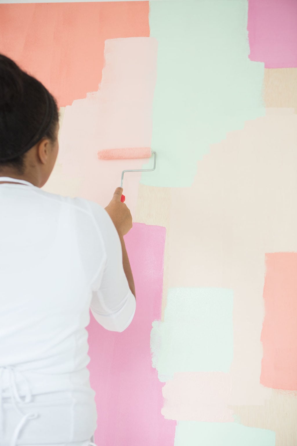
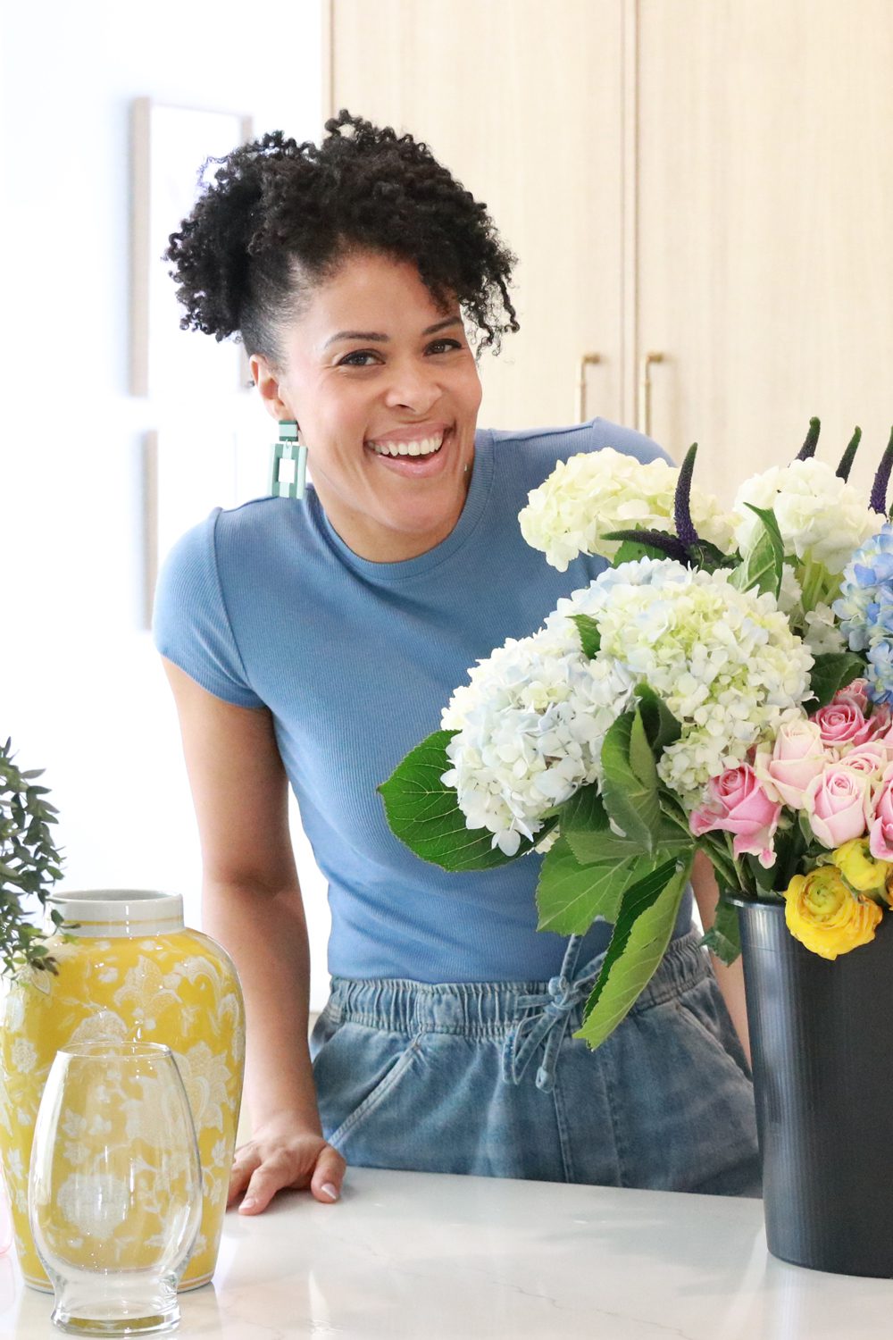


Loved that you went from psychologist to full-time blogger—do you have a go-to paint tip for small project photos?
Aion2build PvE loadouts
When photographing painted DIY steps, I always struggle with getting the true undertone under studio lighting, especially with semi-gloss finishes that bounce glare right into the camera. Do you usually wait for each coat to cure completely before shooting your process flat-lays, or rely mostly on adjusting color temperature and highlights in batch editing afterward?
Amber’s point about matching your paint finish to the lighting setup really resonates, especially with semi-gloss bouncing glare in flat-lays. One thing I’d add from the blogger side: keep a small “reference notebook” of which colors and finishes you’ve already shot under which conditions, with dates, so your visual style stays consistent across months of posts. That documentation habit is exactly what I appreciate in niche fan wikis too — I’ve been reading the beginner guide over at Pokemon Survivor starter tips and it’s refreshing how every page lists its source and the date it was last checked, from tier lists to patch notes. Bloggers could borrow that transparency habit for tutorials that get updated over time.
I loved hearing how you switched from a psychologist to a full-time creator—do you have a go-to easy DIY for your boys lately?
https://hellraiserrevival.online
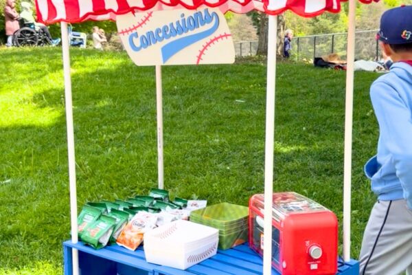
Your story switching from psychologist to full-time creator is so cool—I’m already eyeing that DIY concession stand for my kids.
forgetax
Amber’s note about matching paint finish to your lighting setup is the tip I wish I’d internalised years ago — semi-gloss in a flat-lay still catches every stray highlight from my softbox. One habit that helped me: shoot a cheap chip of the same colour alongside the finished prop so you have a neutral reference to batch-correct against later, and note the cure time in the filename rather than trusting memory. I also like how commenter Megan framed the documentation angle. That same discipline of naming your source and dating every revision shows up in fan-made game resources like this Azeroth Survivors best class tier list, where the spell table and boss timings are dated and the estimate formula is shown openly, which makes the whole thing far easier to trust and cite in a post.
Amber’s point about matching paint finish to your lighting setup really lands, and the semi-gloss glare problem in flat-lays is one I still fight after years of shooting process photos for craft posts. One habit that helped me: shoot a cheap chip of the same colour alongside the finished prop, then note the coat and cure time in the filename so batch-correcting later doesn’t rely on memory. I’d also add a dated reference log of which finishes you’ve shot under which lighting, since visual consistency across months of tutorials is basically a documentation problem. That same transparency about sources and last-checked dates is what I like in fan resources like this Pixel Lineage best class guide, where tier reasoning and drop data are dated openly, which makes the info far easier to trust and cite in a post.
Your articles are always worth reading. Thanks for consistently sharing quality content. Security company in indore
I loved hearing you went from psychologist to full-time content creator— that career shift is so inspiring to me as a creative!
Wasmarcade player status
The point about matching paint finish to the lighting setup is especially helpful for anyone photographing DIY projects; small changes in glare can make a big difference. I also enjoy creative projects that explore different life paths, such as Project Moon Life.
Amber’s point about matching paint finish to your lighting setup really lands, and the semi-gloss glare problem in flat-lays is one I still fight after years of shooting process photos for craft posts. One habit that helped me: shoot a cheap chip of the same colour alongside the finished prop, then note the coat and cure time in the filename so batch-correcting later doesn’t rely on memory. That same instinct about documenting your setup shows up in interactive experiments too — I’ve been playing with a webcam gesture synth where the hand tracking runs on your device and nothing gets uploaded, and the troubleshooting guide for camera permissions and bad lighting is laid out step by step for exactly that reason. Worth a look if you ever film your hands while working: browser gesture synth troubleshooting. Either way, thank you for the reminder that the boring reference shots save the most time later.
The reminder to match paint finish with the lighting setup is so useful for anyone making visual content. I’m building a browser-based Vidu video generator for turning text, images, and references into consistent motion, and the same attention to lighting and framing carries over to short-form product videos. I especially like the idea of planning a clean before-and-after sequence with ViduAI.
These are great practical tips, the kind that only come from repainting something ten times and paying attention each round. The thin-coats-and-foam-roller advice works well beyond blog photos too: I used the same approach refinishing the desk where I run my little browser game project Project Moon Life Sim, and the finish looks dramatically better both in person and on camera. Also appreciate the honest brand comparison — most paint roundups online read like ads. Bookmarking this for my next round of shelves.
Your psychology background is intriguing—has it changed how you approach color choices in your DIY projects, especially when designing for a room’s mood? I’d love to hear if that training gives you a different perspective than purely aesthetic decisions.
As a psychologist turned craft blogger, do you find your therapy training helps you troubleshoot when a DIY project goes wrong, or is it more about improvisation and paint?
The tip about using flat paint to avoid glare in photos really stood out to me, since that’s such a practical detail for anyone documenting colorful projects. I’d add that testing a sample can first saves a lot of guesswork before committing to a full wall. For anyone editing those photos afterward, having a reliable image editor like PhotoCraft makes the whole process smoother.
Amber’s point about matching paint finish to your lighting setup is the tip I keep coming back to, and the semi-gloss glare problem in flat-lays is real. One habit that helped me: shoot a cheap chip of the same colour beside the finished prop, then note the coat and cure time in the filename so batch-correcting later doesn’t depend on memory. I’d also add that process photos benefit from a fixed step count, the same way a good word puzzle rewards a short, clean path — I’ve been using the four-letter word ladder solver to check shortest routes between words, and seeing every step laid out makes me notice missing or redundant stages in my own tutorials too. Documenting each revision, as Megan mentioned, keeps months of posts feeling consistent.
Amber’s point about matching paint finish to your lighting setup is the tip I wish I’d internalized sooner — semi-gloss in a flat-lay catches every stray highlight from my softbox. One habit that helped me: shoot a cheap chip of the same colour alongside the finished prop, then note the coat and cure time in the filename so batch-correcting later doesn’t rely on memory. Priya’s documentation angle is spot on, too. I’ve noticed that same discipline of showing the method openly in fan-made game resources like the Noillirk vs Krillion comparison, where the scoring tiers and common-answer strategy are laid out plainly instead of hidden behind guesswork, which makes the whole thing far easier to trust and cite in a post.
I love how Damask Love celebrates creativity, color, and making everyday DIY projects feel fun and approachable! The playful inspiration here is a great reminder that creative tools can open up even more possibilities for experimenting with visual ideas and bringing imaginative concepts to life. genjutsu ai tool
These paint tips are gold, especially the bit about testing finishes on scrap boards before committing. When I can’t get the right photo for a project post, I sometimes mock up the scene with an AI image generator (Everygen AI) just to plan the colour palette.
These paint and lighting tips are especially useful when photographing pets against DIY backdrops. Matte finishes can reduce glare, while bold seasonal colors help the subject stand out without requiring heavy editing. I’ve also found that a clean, evenly lit photo works best when turning an image into a creative AI keepsake, such as a Halloween-inspired pet unicorn portrait. Using a backdrop color that contrasts with the pet’s fur makes the original photo clearer and often improves the final result. Thanks for sharing such practical advice for creators!
These paint tips are especially helpful for photographing DIY props, since glare and uneven color can completely change the final image. I’ve found that matte finishes and a simple test shot under the intended lighting save a lot of editing later. The same attention to color and texture also makes themed AI portraits feel more polished. For a fun Halloween project, this unicorn couple portrait tool turns a couple photo into an original haunted-unicorn look. It could be a playful source of inspiration for painted backdrops, party decorations, or seasonal craft projects.
Testing finishes first is such sound advice. Before buying paint, I recolor a photo of the room by prompt in ai image editor to see how the shade looks.
These paint tips are so practical for anyone styling photo props on a budget. I especially like the reminder to prime glossy surfaces before spraying — so many projects fail right there. I run a fan site about Firefly Wedding and we keep planning a Meiji-era inspired photoshoot, so this guide is bookmarked. Thanks, Amber!
This article has given me a new perspective on full-time entrepreneurs. I believe that including a video would help even more people gain a better understanding.
Amber’s point about matching paint finish to your lighting setup is the detail most craft bloggers gloss over, and the semi-gloss glare issue in flat-lays is real. Something that helped me: shoot a cheap chip of the same colour beside the finished prop, then bake the coat and cure time into the filename so batch-correcting later doesn’t depend on memory. I’d also second the documentation habit mentioned above — naming your source and dating each revision makes a tutorial far easier to trust when readers cite it months later. Fan-made resources do this well too; the PokeBonk League tier list shows its Kit Score formula and last-checked dates on every page, which is the kind of transparency bloggers could borrow for posts that get updated over time.
Appreciate you sharing this. If you enjoy quick daily brain-teasers, I built a free daily NFL game where every day is a new real-game scenario to coach through. Happy to hear feedback!
Is there a full painting tutorial connected to this image attachment? A prominent link back to the main instructions would help readers who arrive here from search understand the materials and steps involved.
Amber’s point about matching paint finish to your lighting setup is the one I keep coming back to, especially since semi-gloss catches every stray highlight in a flat-lay. Something that helped me was shooting a cheap chip of the same colour beside the finished prop and noting the coat and cure time in the filename, so batch-correcting later doesn’t hinge on memory. I’d also back up Megan’s documentation angle — a dated log of which finishes you shot under which lighting does wonders for visual consistency across months of posts. That same discipline of showing the numbers behind a result is what makes free estimation game seven rounds oddly satisfying to play, since you can see exactly how close each guess landed and learn from it.
Amber’s advice about matching paint finish to your lighting setup hits home, and the semi-gloss glare problem in process shots is one I still fight after years of photographing craft projects. What helped me was shooting a cheap chip of the same colour beside the finished piece, then recording the coat number and cure time right in the filename so batch-correcting later never depends on memory. I’d also add that keeping a dated reference notebook of which colours and finishes you shot under which conditions keeps your visual style consistent across months of posts. That same habit of stating sources and revision dates is what I appreciate in fan-made resources like this Roblox Candy Kingdom Defense traits reference, where each page flags what’s confirmed versus estimated, which makes it far easier to trust and cite in a tutorial.
Amber’s advice about matching paint finish to your lighting setup is the detail most craft bloggers skip, and the semi-gloss glare problem in flat-lays is one I still wrestle with after years of shooting process photos. One habit that saved me: shoot a cheap chip of the same colour beside the finished prop, then log the coat and cure time in the filename so batch-correcting later doesn’t rely on memory. The documentation angle in these comments is smart, and it’s the same transparency I appreciate in creative tools that spell out exactly what they generate, like this AI rap video from a photo tool that writes original lyrics and lip-syncs one photo in about three minutes. For tutorial posts, that visible process is what keeps readers coming back.
Create your own AI influencer in minutes! ✨
I really like the idea of bringing useful AI tools easy ai tool together in one place. Finding simple, practical tools without having to create multiple accounts can make a real difference to the user experience. I’m also exploring ways to make AI tools more accessible and easier to use. Keep up the great work!
Amber’s point about matching paint finish to your lighting setup is the one I keep coming back to, because semi-gloss in a flat-lay still throws a highlight straight into the lens no matter how I angle the softbox. The chip-and-filename habit others mentioned is genuinely useful, but I’d add one more step: log the batch corrections too, not just the raw shot, so you can reproduce a look months later without re-guessing the white balance. That documentation discipline is what makes a resource citable, and it’s why I keep returning to the Clover RPG Wiki magics skill table — every page shows its sources and a last-checked date, from cooldowns and roll chances to weapon stats. Craft bloggers who update tutorials over time could borrow exactly that transparency.