Have you ever been curious about strategies for combing color? How to get out of the color rut? Have you ever been told that when it comes color & design, “You’ll just…“know” when it’s right.” Yeah…ummm…go ahead and file that under “Statements That Are Not Helpful.”
Now, I do think that there comes a point when you get comfortable with color and develop a “knack” for knowing when things are well combined. That doesn’t mean that we all have to sit around waiting for the color fairy to anoint us with magical design powers. After doing a fair bit of reading on interior design and art, I think there are plenty of tips, strategies and theories that can be super useful for us paper crafters and DIY-ers.
I am far, far………far from an expert on design, but I have attended the University of Google and I have read ten too many issues of House Beautiful and BHG. I’ve learned lots, so I thought I’d share.
Over the next month (and maybe more) – I’ll be posting lessons on color for crafters. There will be projects, tutorials and lots and lots of resources for you to file away .
Today, we’re gonna talk about the all mighty color wheel and the differences in the terms, “hue,” “tint” and “shade.” It’s interesting stuff …or maybe I’m just a nerd. Either way, I hope you enjoy!
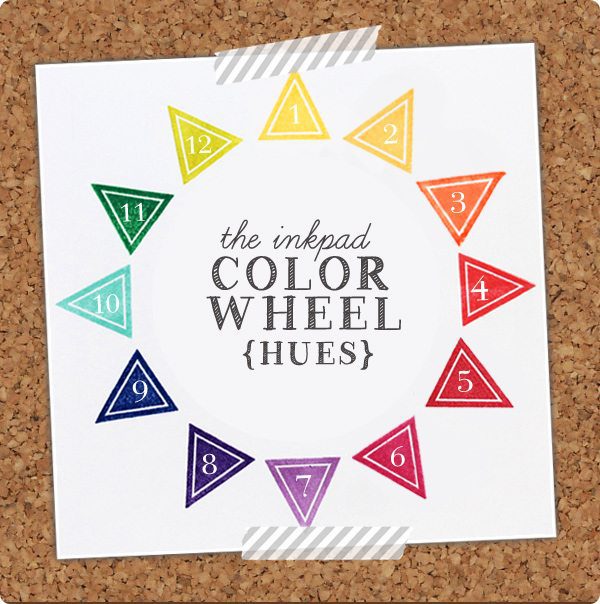
{1} Clear & Simple Stamps Say Yellow to Your Fans {2} Amuse Papaya {3} Amuse Orange {4} Amuse Poppy {5} Amuse Cherry {6} Amuse Berry {7} Amuse Grape {8} Clear & Simple Stamps Purple Crushed Velvet {9} Clear & Simple Stamps Your Style Blue Me Away {10} Amuse Mermaid {11} Clear & Simple Stamps Emerald Bling {12} Amuse Wasabi
![]() There’s Hefner, there’s Grant…and then there are inkpads. We’re gonna talk about the latter of these “hues.” A few week’s ago, I used the terms “hue” “tint” and “shade” interchangeably. I thought they all were synonyms for “color.” Welp – it turns out that in the world of design & artsy people, these words have very different meanings.
There’s Hefner, there’s Grant…and then there are inkpads. We’re gonna talk about the latter of these “hues.” A few week’s ago, I used the terms “hue” “tint” and “shade” interchangeably. I thought they all were synonyms for “color.” Welp – it turns out that in the world of design & artsy people, these words have very different meanings.
“Hue” refers to the traditional color wheel as we know it…the rainbow. Twelve hues make up the color wheel, including the three primary colors: red, blue and yellow.
In the world of paper crafting & DIY – “hues” are very common. The bold, heavily saturated look of these colors is perfect for creating cheerful cards and party decor. For interior designers, an entire room of hues might create a jarring environment…luckily we crafters don’t have to worry about that! Cards and other paper crafts are small and can be packed with color. Use the entire spectrum if you’d like – or just select a few (more on how to select colors will be coming up in a later post!)
All this theory is great, but how does it work in practice? Here’s a quick & simple card that I created with hues.
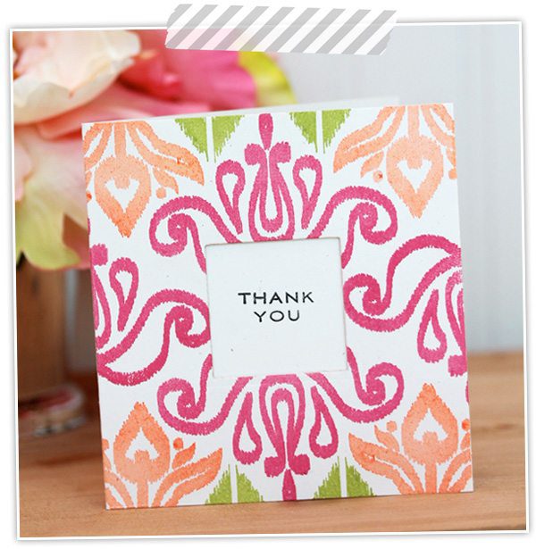 Bright and bold is my favorite look, so this ikat card is right up my alley! Most of the cards and crafts I create feature bright hues.
SUPPLIES:
Papertrey Ink Irresistibly Ikat | Papertrey Ink Inside & Out: Thank You | Amuse Berry Ink | Amuse Orange Ink | Amuse Grass
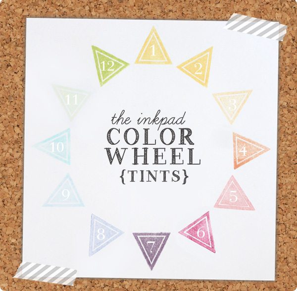 {1} Amuse Lemon Whip {2} Amuse Buttercup {3} Clear & Simple Stamps Creamsicle Cardigan (2nd generation impression) {4} Amuse Apricot {5} Amuse Watermelon {6}Amuse Berry (2nd generation impression) {7} Amuse Heather {8} Amuse Colbalt (2nd generation impression) {9} Amuse Sky {10} Amuse Ocean (2nd generation impression) {11} Amuse Pistachio {12} Amuse Lime
![]() Adding white to any of the hues in the color wheel creates a “tint.” In most cases, “tint” is synonymous with “pastel”, but this may depend on how much white is added to the hue. If only a teeny bit of white is added, the color may still appear quite vibrant.
Adding white to any of the hues in the color wheel creates a “tint.” In most cases, “tint” is synonymous with “pastel”, but this may depend on how much white is added to the hue. If only a teeny bit of white is added, the color may still appear quite vibrant.
![]() Unless you use paint or other mixed media in your crafting, it’s unlikely that you’ll come across many opportunities to mix your own colors to create pastels. For paper crafters like you and me, pastel inks are easy to find and a great way to add soft tints to your project. Another way to create a pastel shade is to use a second generation impression of your ink. For example, a vibrant orange hue becomes a pastel color if you first stamp off the page and use the second generation impression in your project.
Unless you use paint or other mixed media in your crafting, it’s unlikely that you’ll come across many opportunities to mix your own colors to create pastels. For paper crafters like you and me, pastel inks are easy to find and a great way to add soft tints to your project. Another way to create a pastel shade is to use a second generation impression of your ink. For example, a vibrant orange hue becomes a pastel color if you first stamp off the page and use the second generation impression in your project.
For me, pastels are great for soft feminine projects or for creating a springtime feel.
![]()
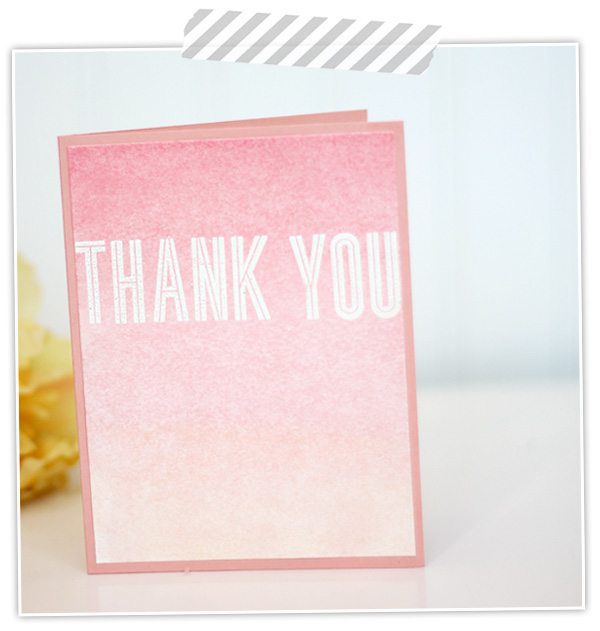 This simple card features a soft pastel ombre that I created using Faber-Castell Gelatos. They blend beautifully! This layout and pastel color scheme is a perfect feminine stationery. Sidenote: I am obsessed with these gelatos. I want to paint my walls with gelatos!
SUPPLIES:
Faber-Castell Gelatos Gift Set | Papertrey Ink Headline Alphabet | Paper Presentation Ginger Cardstock
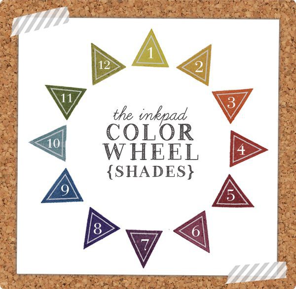 {1} Amuse Saffron {2} Clear & Simple Stamps Golden Tiara {3} Clear & Simple Stamps Orange you Fabulous {4} Clear & Simple Stamps Rouge Ruffles {5} Clear & Simple Stamps Maroon Maven {6} Amuse Currant {7} Clear & Simple Stamps Purplicious {8} Clear & Simple Stamps Purple Crushed Velvet {9} Amuse Navy {10} Amuse Eucalyptus {11} Clear & Simple Stamps Kraft Like a Rockstar Green {12} Amuse Fern
“Shades” are basically the opposite of “tints.” Shades are created by adding black to any of the twelve hues in the original color wheel.
“Shades” are probably my least frequently used colors. Even when stamping out the above color wheel, I noticed that several of these inks were unused! At first, “shades” seemed a bit “dingy” to me, but after thinking about it more they are perfect for a wide range of projects. Choosing a few shades from this color wheel can create very masculine projects, which is something that I struggle with. Shades are also great for autumn themes.
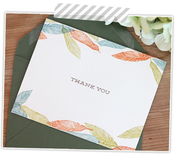 Even delicate images like these feathers can become masculine when stamped using “shades” rather than “pastels.” I’m sure you can image how the feeling of this entire card would change if created with soft “tints.” For me, the “shade” color wheel is super helpful for tackling masculine projects that are often so difficult.
SUPPLIES:
Studio Calico Oh Snap! | Studio Calico Frame & Feathers | Amuse Fern | Amuse Eucalyptus | Clear & Simple Stamps Orange You Fabulous
Interested in a few more samples that show today’s “lesson” in action? Here we go:
- Perhaps my most favorite use of hues…ever!
- Bold teal and yellow make this a fabulous sample of hues in action.
- I love the simple layout!
- This paper crafted wreath is so well executed and the the pastel color palette is so pretty.
- Debby Hughes of Limedoodle blog does such a great job with shades on this card.
- Add pastels to your next gift with this simple idea.
- {DID YOU KNOW?} Damask Love now has a “Cardstock & Ink Photo Library” where I will be posting photo samples of some of my favorite color collections! I’ll update it over time so keep checking back. Today, I’ve updated the library with a photos of the A Muse Studio ink collection. Just click the graphic on the sidebar.
Did you make it through?! When it comes to colors, do you have a “go-to” color wheel? Which of these color wheels best represents your own style and preference?


seriously? you are amaze-balls. thanks for this!
So much wonderful information in this post…thanks, Amber!
Just wanted you to know that I visit your blog daily. I figured I needed to take a moment and tell you that. You post something different almost every day that is filled with amazing info, tips and techniques. I wanted you to know how much I appreciate your posts. You’re so very talented………thanks
ditto that Amber
Thank you, thank you, thank you for sharing your creative talents, I read your blog daily and I love it – one of the wonderful highlights of my day! I am always inspired and excited to try the many ideas you share. Thank you for your enthusiasm, energy, fun and humor!
ditto this one too!
Awesome lesson on color…and thanks for linking up my hues card! 🙂
Great lesson, Amber. Thanks! Another way to get shades (if you are working with paint) is to add the complement instead of black. Technically that is a Tertiary Color (vs Primary or Secondary) but the tones can be a richer version of a greyed down shade.
Believe it or not, work with this (color theory)enough and it does become more natural and effortless and you start instinctively knowing what works and more importantly why something doesn’t work so well. Thanks for helping us do that.
A video tutorial on that gelato card would be great. Love that card bunches!
Ohh…don’t you worry! I have lots of plans for these gelatos and I’ll definitely be sharing them on the blog!
Oooh, so excited for your color library!! FTR, I often search your blog projects when I’m trying to decide which Impress Fresh Inks to buy next. 🙂
Hey GinaBoo!I am pretty excited for the color library too! I hope it’ll be a good resource for all us crafty people. Sometimes you just need the PERFECT shade of red, ya know?!?
I commend you for doing this post, thank you! I used to think understanding color and knowing what goes with what is just innate. Guess what? It’s not! (Love Gelatos too!)
I totally agree! I think with practice it can become innate, but it certainly doesn’t have to start out that way! I also find that using some of these color theory ideas is very helpful for challenging me to create with colors that I don’t typically use. I feel like I am always using the same ones!
Great, great info, Amber! Thank you so much. I would say I use the first color wheel and the shade one. I rarely use pastels. When I’m really stuck on knowing what colors to use I pull out my old Stampin’Up color wheel.
Fantastic, Amber – thank you, for sharing all your amazing insight and genius with us 🙂
this is some great stuff keep on sharing all the wonderful info and super cute projects.
If you want to get a great deal from this piece of writing then you have
to apply these methods to your won web site.
I’ve been using https://www.nothingbuthemp.net/pages/how-long-does-the-high-from-thc-hybrid-products-typically-last regular in regard to all about a month nowadays, and I’m justifiably impressed at near the sure effects. They’ve helped me judge calmer, more balanced, and less tense everywhere the day. My sleep is deeper, I wake up refreshed, and uniform my core has improved. The trait is famous, and I worth the common ingredients. I’ll categorically preserve buying and recommending them to everybody I know!