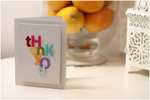
For today’s Style Watch project, I am sharing a card that I created with my love of lettering in mind. I was so excited by the “sans serif” design of the Lowercase and Uppercase alphabet dies, that I combined these dies with an array of bold colors and an abstract layout. It creates such a clean and graphic look!
The result is fun and a perfectly unique way to say “Thank You.”
Until Later Loverlies,
Amber KG


so cool Amber…and creative too 🙂
Oh, that’s AWESOME!!!
so very pretty and powerful!
Love it!
TFS Amber~
love.
and I am DYING to know what you are up to. I know it will be fabulous!
Yeah, I love typography too! Your card is fantastico! Wish my brain worked more like yours sometimes!
It is hard to make a fantastic web design without attractive and intriguing icons. I’ll do my best to help, and this knowledge could be beneficial to anyone. I remember searching up where I could acquire these cases and other goods. Fortunately, I was able to help because I discovered https://masterbundles.com/graphics/backgrounds/ , which has a vast selection of icons. I’ve never seen such a diverse selection of selections before!
If you are looking for a similar font, you could try searching for “alphabet stamp sets” or alphabet dies online. You can also try contacting https://letras-bonitas.io/ to ask them what fonts they used in the article.
Looking for expert guidance on protecting assets while qualifying for Medicaid? As experienced elder law attorneys near me, our team at Ohio Medicaid Lawyers provides specialized legal assistance with Medicaid planning, estate planning, and asset protection strategies. We help seniors understand medicaid eligibility income charts and navigate the complex 5-year lookback period. Visit our website for comprehensive information about Ohio medicaid income limits 2024 and schedule a consultation with a trusted elder care attorney who can safeguard your future.
Looking for Medicaid planning legal advisory? This firm offers specialized knowledge and guidance.
This mature website is perfect for singles who value depth and sincerity. The registration process encourages users to share real information about themselves. Matches feel more intentional and aligned with long-term goals. I like that there’s less pressure and more patience in getting to know someone. The atmosphere is calm and respectful. It’s refreshing compared to fast-paced dating apps.
I saw better variations on http://www.pfpuniverse.com while looking for anime pfp, and the cool pfp section had a few strong picks.